
The most current version of the studio swatches and templates can now be found on the COMD Risograph Moodle.
ECU students and community: you can enroll yourself in the Moodle, and find these files in the “Risograph Resources” section.
This is a set of templates and colour swatches that you can use to prepare artwork for the COMD Risograph, with our studio library of inks set up as spot colours. (This is optional. Any method for preparing Riso artwork that results in black and white or grayscale page for each ink colour is fine.)
Here’s what you’ll get:
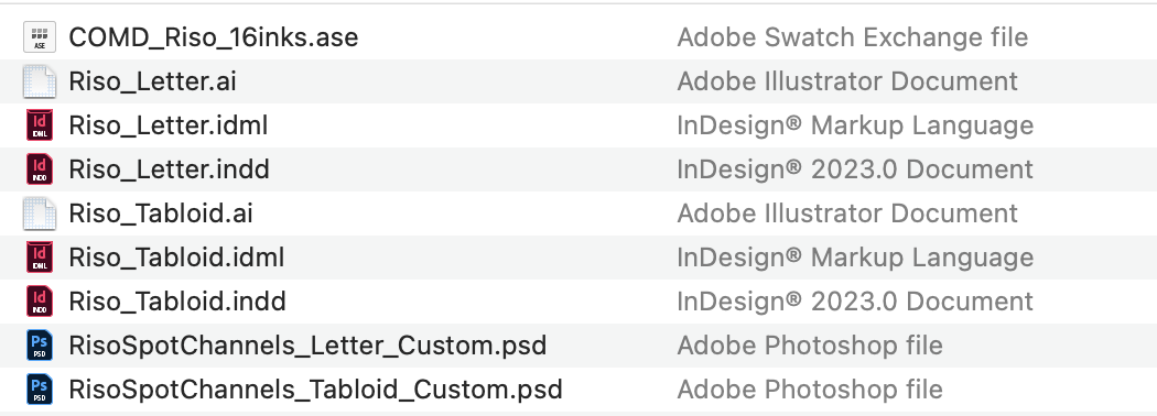
The download is a .zip file. If you’re using a Mac, just double-click on it to open it. If you’re using a Windows computer, you may have to choose “Extract” to get the files and folders from the zip.
File Types
- .ase is an “Adobe Swatch Exchange” file that you can use to load the swatches into any Photoshop, Illustrator, or InDesign file.
- .ai are Illustrator files. These are blank files set up in either Letter or Tabloid size, with the colours already set up in the Swatches window.
- .indd and idml are InDesign files. These are blank files set up in either Letter or Tabloid size, with the colours already set up in the Swatches window. .indd is the standard InDesign file type, and .idml is the backup option to try if there are compatibility issues between newer and older versions of InDesign.
- .psd are Photoshop files. These are blank files set up in either Letter or Tabloid size, with the colours already set up in the Channels window (not swatches!)
Jump ahead to:
- How to Use the Colours in Illustrator
- How to Use the Colours in InDesign
- How to Use the Colours in Photoshop
- How to Generate Grayscale Separations
- How to use Pantone colours instead
How to Use the Colours in Illustrator
To load the .ase swatches into your own file:
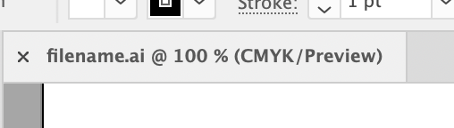
First, make sure your document colour mode is set to CMYK, not RGB. You can choose this when making a new document, or switch it by going to File > Document Color Setup in the menu.

You can also check the colour mode by looking at the tab with your file name:
Next, open Window > Swatches, click the menu icon in the top right corner, and then go to Open Swatch Library, and then Other Library, and choose the .ase file that’s in the downloaded folder.
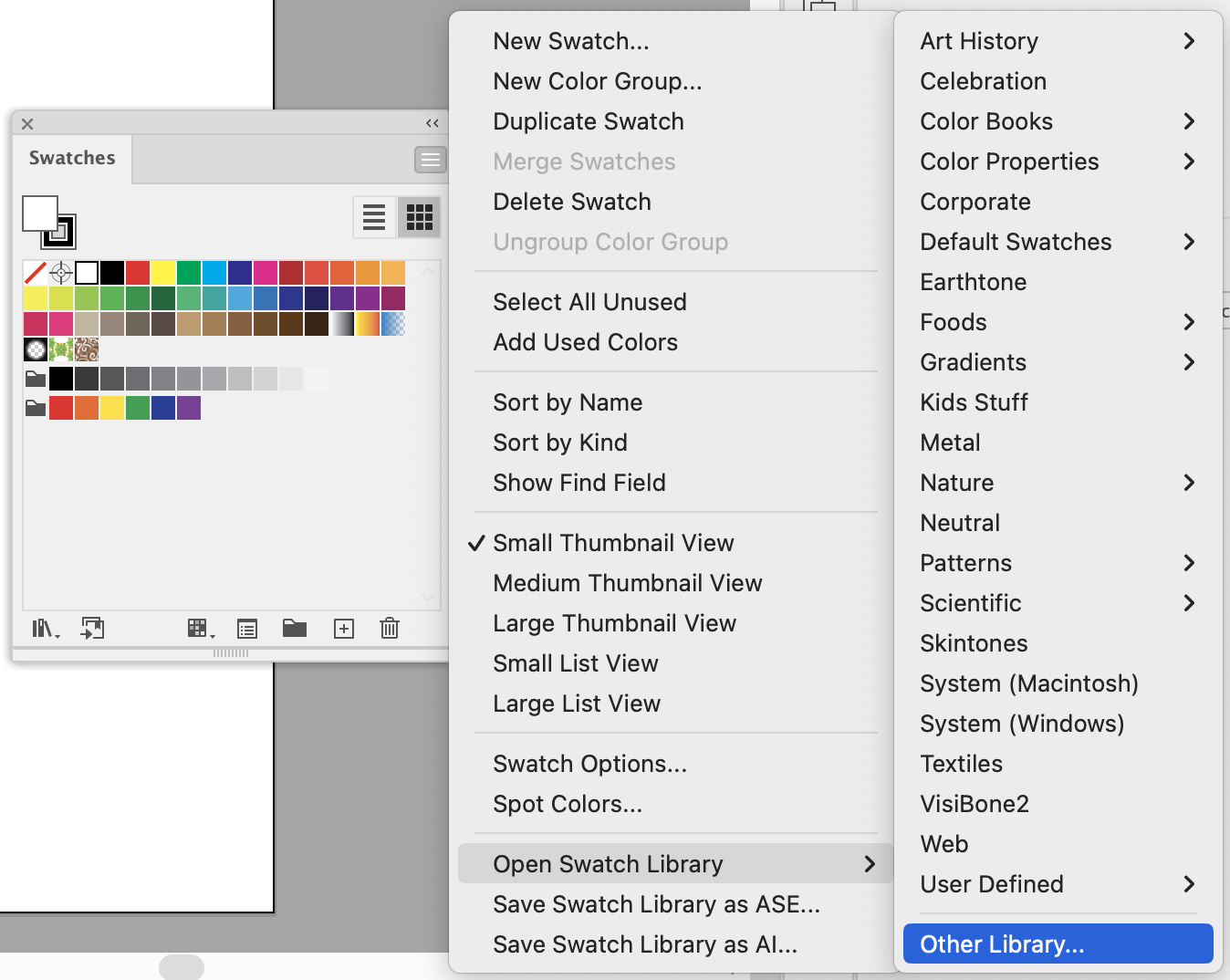
You can also start with the blank .ai files, which have the swatches pre-loaded.
Applying the Colours:
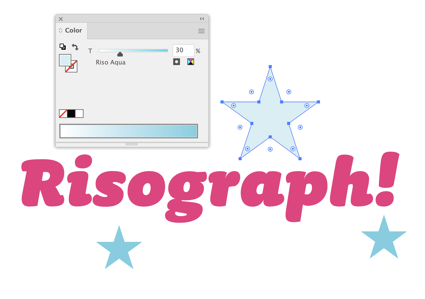
You can apply the Riso swatches to the fill and stroke colours for your Illustrator objects like type and vector artwork:
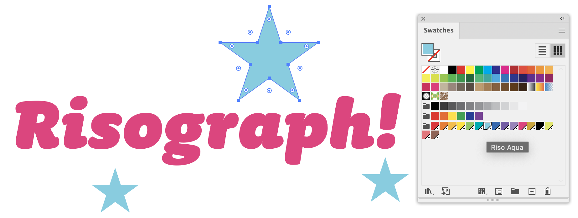
Each ink colour has a range from 0–100%, and you can adjust this using Opacity, or the tint percentage in the Colour window.
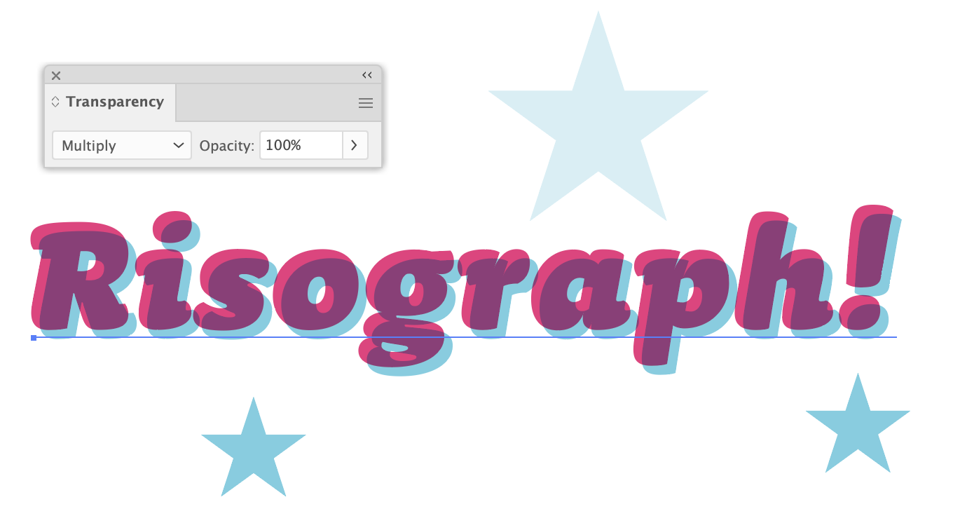
Setting the blending mode to Multiply in the Transparency window will make overlapping objects overprint and layer the inks:
If you leave it as Normal, overlaps will instead be treated as a knockout (leaving a cutout white space in the bottom colour.) We can preview what the separations will look like by going to Window > Separations Preview:
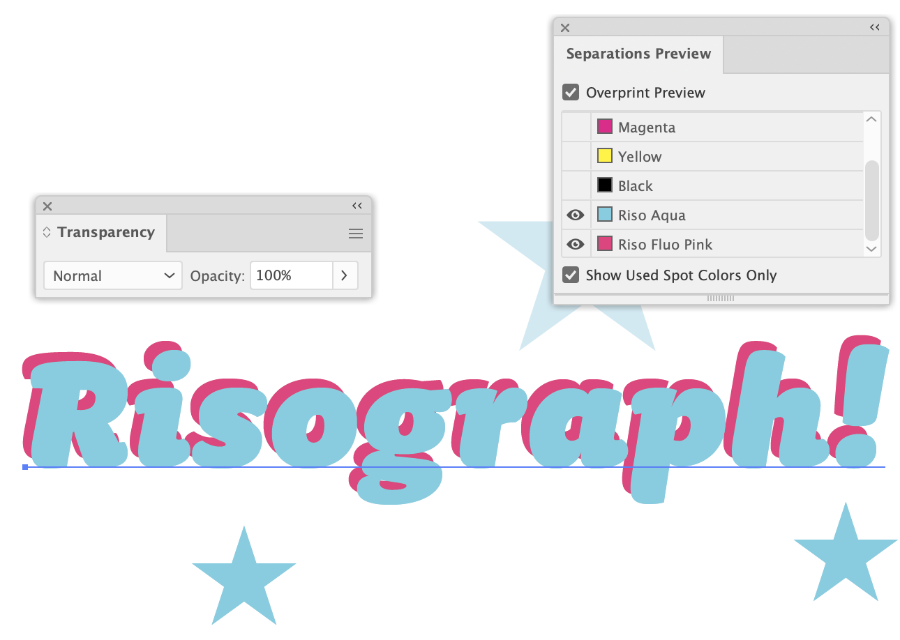
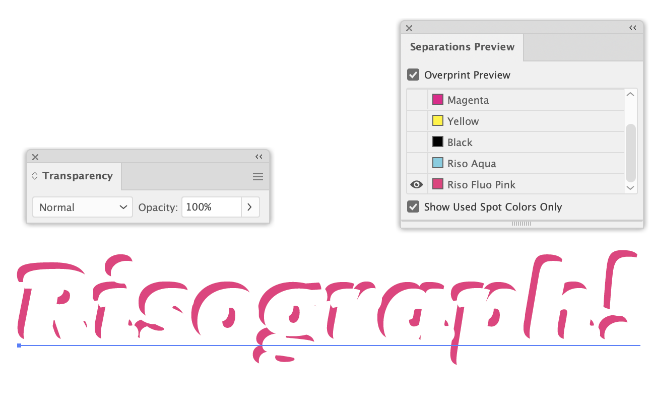
We get a list of every colour that Illustrator recognizes as a specific ink, and we can turn off the eyes to look at the colours one by one. If both pieces are set to blending mode Normal, there’s a cutout in the pink shape for the aqua:
We can also use the Riso swatches to do an automatic recolour on multicolour art. First, gather the Riso swatches that you want to use in their own little folder in Swatches:
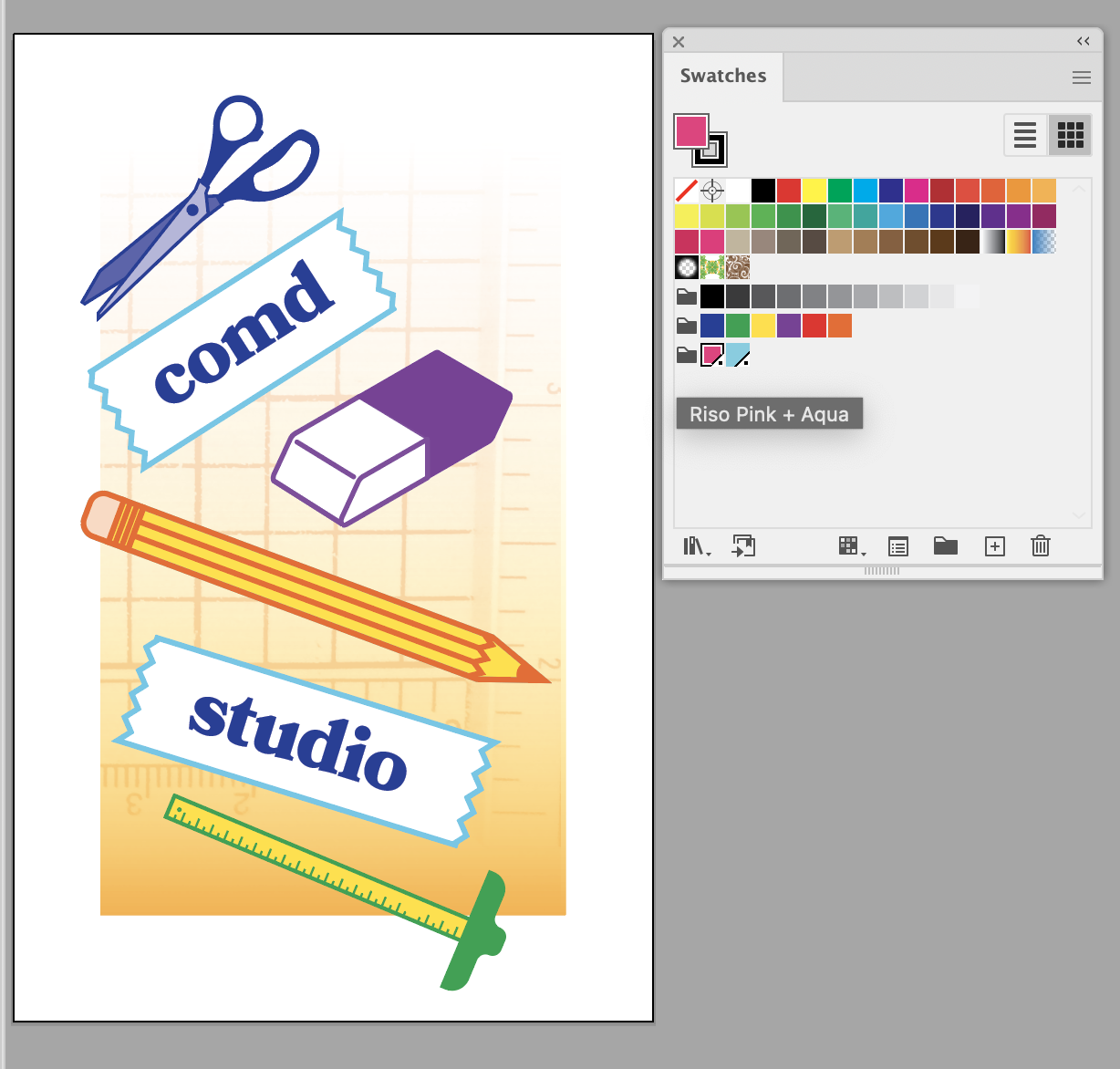
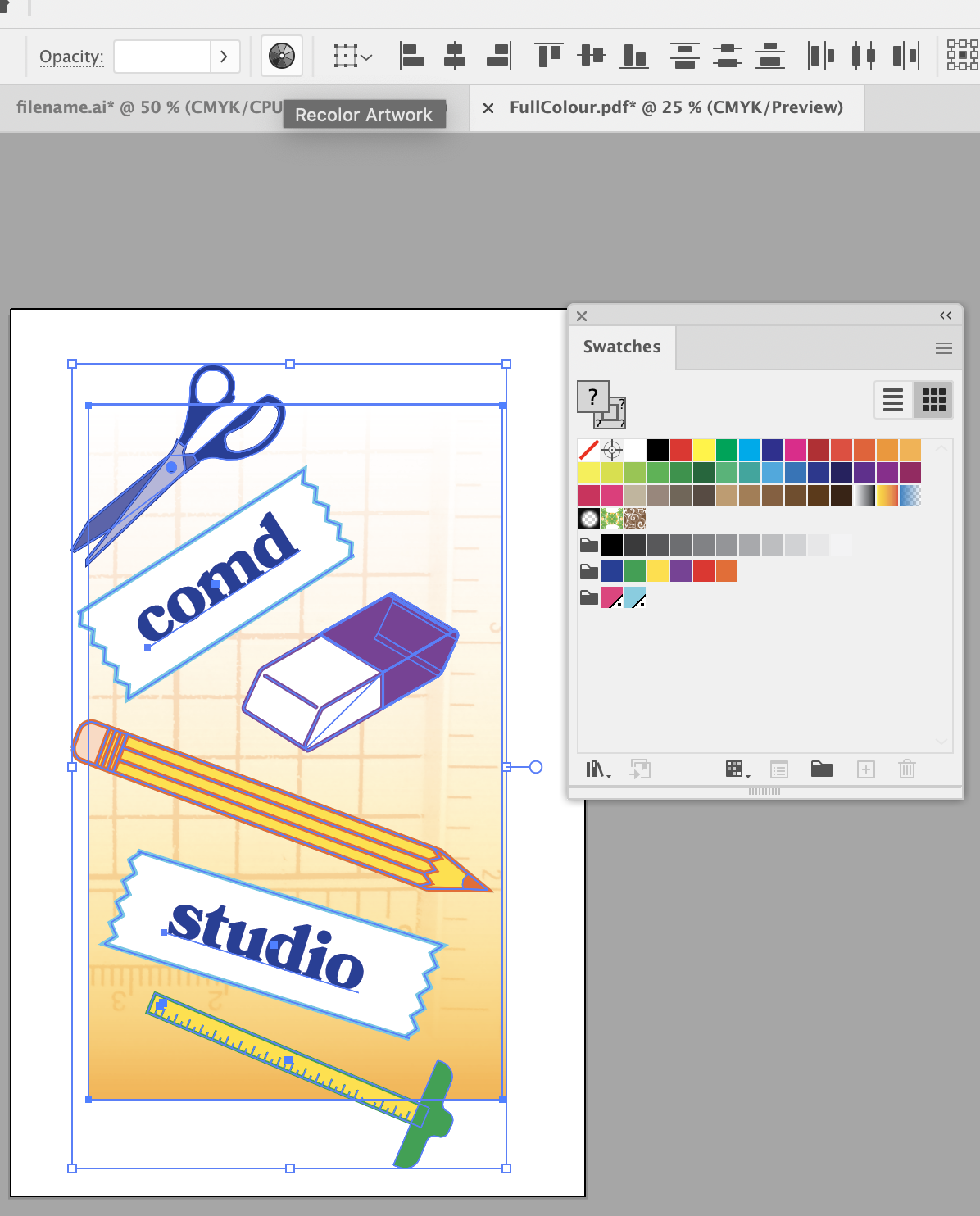
Now, select your artwork, and either click the wheel icon or go to Edit > Edit Colours > Recolor Artwork in the menu.
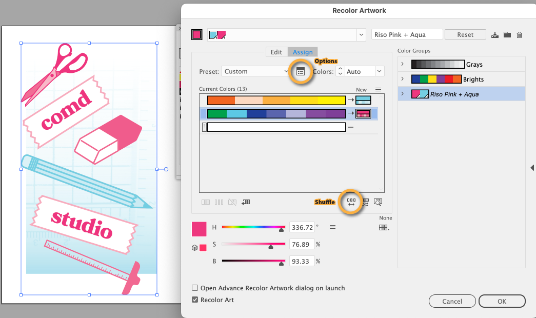
Then, click Advanced, and choose your palette under Colour Groups. You can drag colours around in the “Current Colors” list to switch them, and there are more options to play with about how it handles the recoloring.
The spot colours can be directly applied to vector shapes, type, and gradients, but placed pixel images need to be prepared in a specific way to be usable for this. Please see these tutorials about Placed Images With Riso Spot Colours and Duotones
We’ll be using this spot colour file to generate grayscale separations for the actual print files. In the meantime, save it as either an .ai, or a .pdf using either the “Illustrator Default” preset, or making sure Output > Color Conversion is set to “No Conversion” (after all your work, you don’t want to lose the special colour setup!)
When you’re ready to generate the gray print files, you can either bring your spot colour file to a tech appointment, or take a look at how to generate your own separations.
How to Use the Colours in InDesign
To load the .ase swatches into your own file:
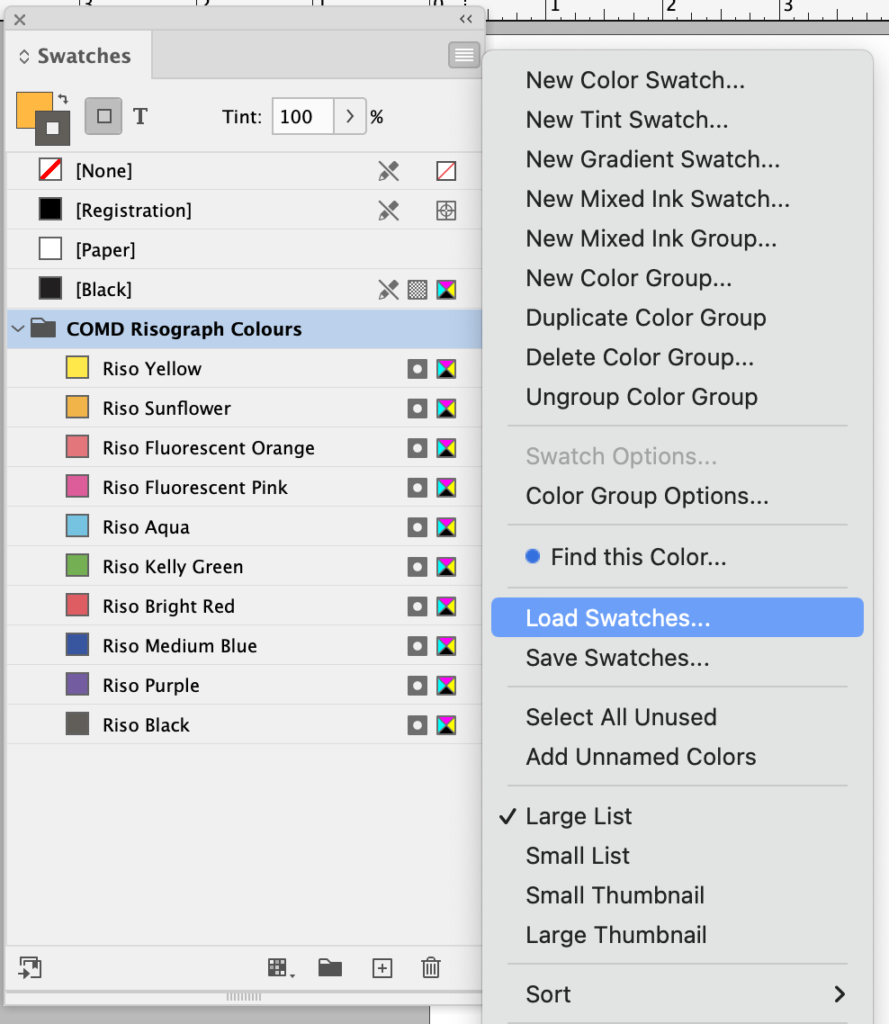
Open Window > Color > Swatches, click the menu icon in the top right corner, and then go to Load Swatches and choose the .ase file that’s in the downloaded folder.
You can also start with the blank .indd or idml files, which have the swatches pre-loaded.
Applying the Colours:
You can apply the Riso swatches to your InDesign objects like type and vector artwork.
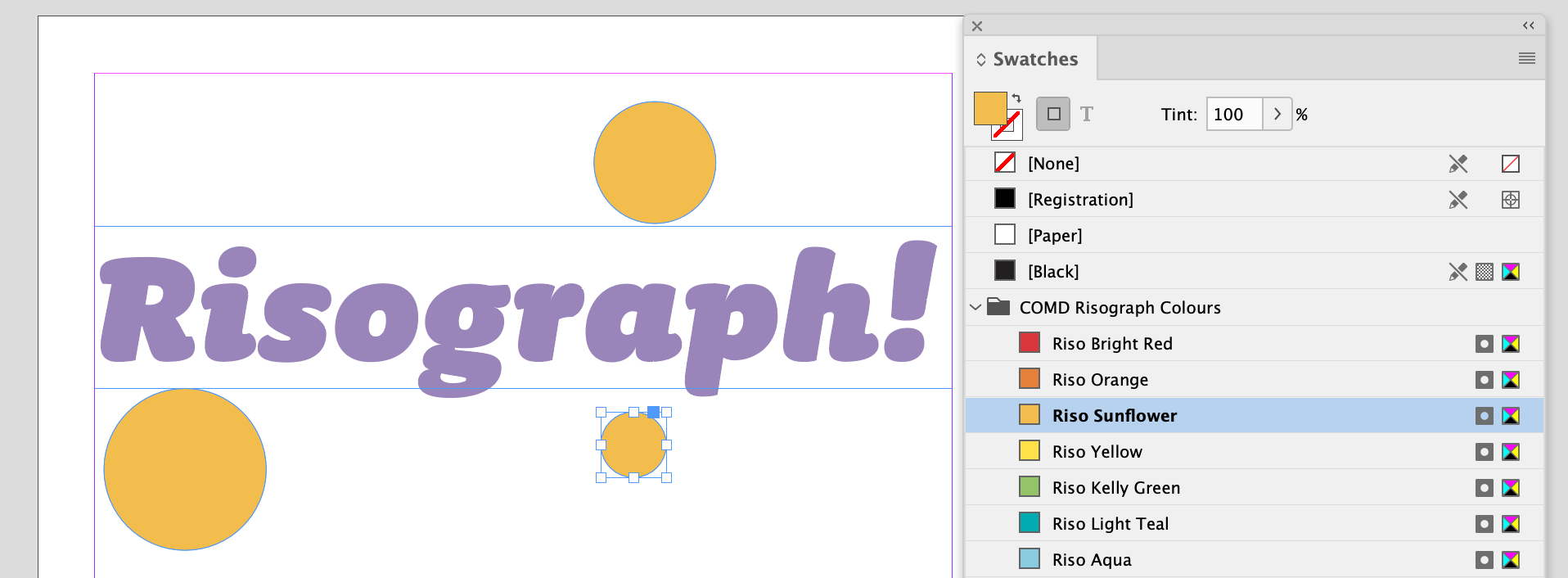
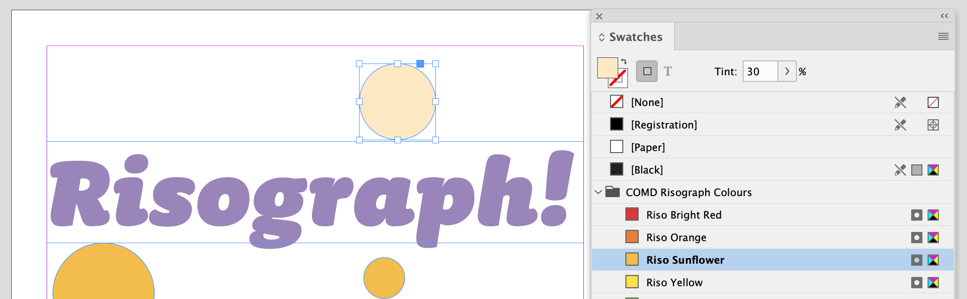
Each ink colour has a range from 0–100%, and you can adjust this using Opacity, or the tint percentage in the Colour or Swatches windows:
Open Window > Output > Separations Preview to see a list of every colour that InDesign recognizes as a specific ink. You should be able to turn on “View: Separations”, click the eyes to turn off CMYK and any colours you’re not using, and only see the artwork in the colours you are using, with the right parts assigned to each ink.
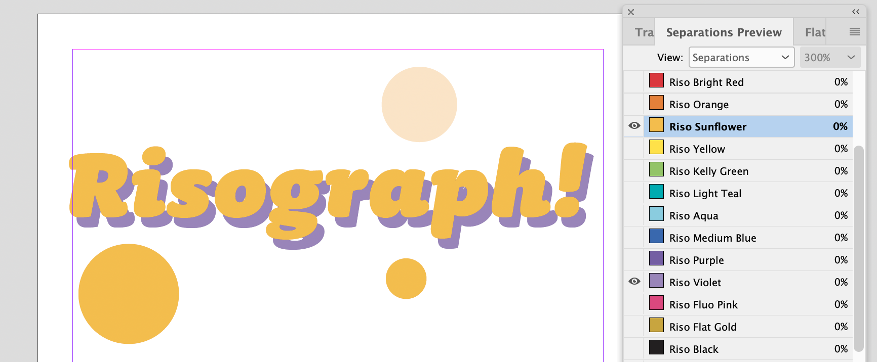
If we have overlapping colours at 100% opacity, with blending mode Normal, it will make a knockout, a white cutout in the bottom colour for the top one.

Looking at only one separation at a time in InDesign shows it in grayscale.
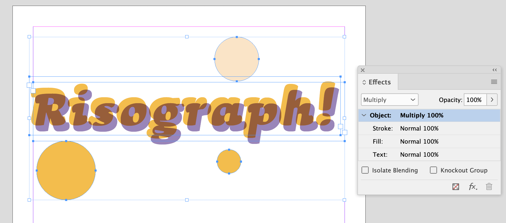
If you want the inks to intentionally overlap without a cutout, set the blending mode to Multiply in the Effects window.
The spot colours can be directly applied to vector shapes, type, and gradients, but placed pixel images need to be prepared in a specific way to be usable for this. Please see these tutorials about Placed Images With Riso Spot Colours and Duotones
We’ll be using this spot colour file to generate separations for the actual print files. In the meantime, save it as an .indd/idml, or export a .pdf using either the “High Quality Print” preset, or making sure Output > Color Conversion is set to “No Conversion” (after all your work, you don’t want to lose the special colour setup!) For PDFs, make sure you choose Adobe PDF Print, not Adobe PDF Interactive.
When you’re ready to generate the gray print files, you can either bring your spot colour file to a tech appointment, or take a look at how to generate your own separations.
How to Use the Colours in Photoshop
Photoshop is different than Illustrator and InDesign. The main colour setup for special inks is Channels, not Swatches.
Open the Letter or Tabloid sized .psd files, and open Window > Channels, and you’ll see that there’s a channel for each Riso colour. You can copy and paste black and white or grayscale artwork for each colour into its channel.

- You can edit each channel with any Photoshop tools and functions that let you work in black/white/gray, including selections, brushes, gradients, and more. It’s often useful to do Image > Adjustments > Levels on certain channels (shortcut: command or ctrl L) to adjust the range of darks, lights, and midtones.
- Channels are far less flexible to work with than Layers, so it’s a good idea to have your art for each colour as pre-prepared as possible, for the minimum amount of editing directly in Channels!
- The channels show a very rough mockup of how the ink layering might look. You can play with dragging the channels up and down to switch the order…but it never looks exactly like it will in print, and some of the Riso ink colours are actually impossible to show accurately on screen. Please refer to our studio print samples and colour charts for the best reference for what colour layering combinations will look like!
- You can also open up Channels in any other type of image file – you’ll see one channel for Gray files, 3 for RGB, and 4 for CMYK. You can copy/paste from any of those into the Riso channels. For colour artwork, CMYK works much better than RGB, because CMYK channels are already based on printer inks. RGB channels are for mixing screen colours with light, so that doesn’t really match the way inks work in printing.
- When you’re ready to generate a grayscale separation for each channel for print, go to the menu in the top right corner of Channels, and choose “Split Channels”. It will open a grayscale file for each channel, but also close your multi-channel file (so, make sure it’s saved as a .psd if you’ll still need it!)
- A .psd file with this custom channel setup won’t work to place in InDesign or Illustrator. However, it will work if you Save As and choose “Photoshop DCS 2.0” as the file type. If you want everything to consistently match the swatches you’re using another file, the colours all need to have exactly the same names. Sometimes it’s easier to just split the channels, and apply the swatches to the placed Gray images for each ink in your .ai or .indd file.
Generating the Ink Separations
In Illustrator or InDesign:
When you’ve got all the pieces of your design assigned to your Riso ink swatches…
- Go to File > Print (yes, this is under Print, not Save or Export!)
- At the top of the print window, where you’d choose a printer: if you’re using Windows, pick “Adobe PDF”, and if you’re using a Mac, pick “Adobe Postscript File.” This process is a little easier with Windows, so if you have a Mac laptop, you might want to do this part on the Riso computer instead.
- Choose the settings like the size of your paper, and whether you want to include bleed and crop marks.
- Then, go to “Output” in the print window sidebar. Change “Composite” to “Separations (Host-Based)”. You’ll see a list of all the inks in the file. Click the little printer next to each of them to take away any that you’re not using. You only want that printer icon next to the separations that you want.
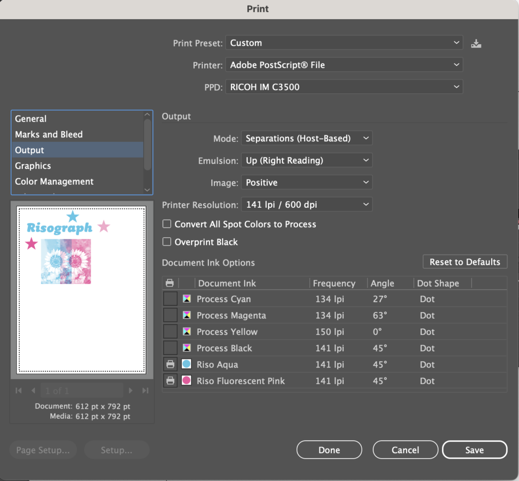
- Now, click either “Save” or “Print” (this depends on your computer and which program it is.) If you’re using Windows: it will save a PDF file with a page for each grayscale separation, and the colour names should be in the page numbers. Easy! If you’re using a Mac: It will save a Postscript .ps file, and you’ll need to convert that to a PDF. The best way to do that is by opening it with a program called Acrobat Distiller. If you have Adobe Creative Cloud and Acrobat installed, it should be on your computer…but if not, and if you don’t want to install it, it’s available to use on the studio computers.
- If any of these settings aren’t available in your Print window (unfortunately, they aren’t on everyone’s computer), you can bring your working .ai or .indd file to a school computer and do the separations there.
- We can also generate separations from a PDF from Illustrator or InDesign. Just make sure that, when you save or export it, the Colour Conversion setting under Output is set to “No Conversion.” If it’s from InDesign, it also has to be “Adobe PDF (Print)”, not “Adobe PDF (Interactive)”
- If your separated gray PDF pages have ugly thin white lines on them: don’t panic! It sometimes looks like that on screen, but that doesn’t show up in the print.
In Photoshop
When you’ve got the artwork for each ink ready in each channel, go to the side menu in the Channels window, and choose “Split Channels”. It will create and open a grayscale file for each of them. For your print files, for each of them, go to File > Save As, and choose “Photoshop PDF” as the file type.
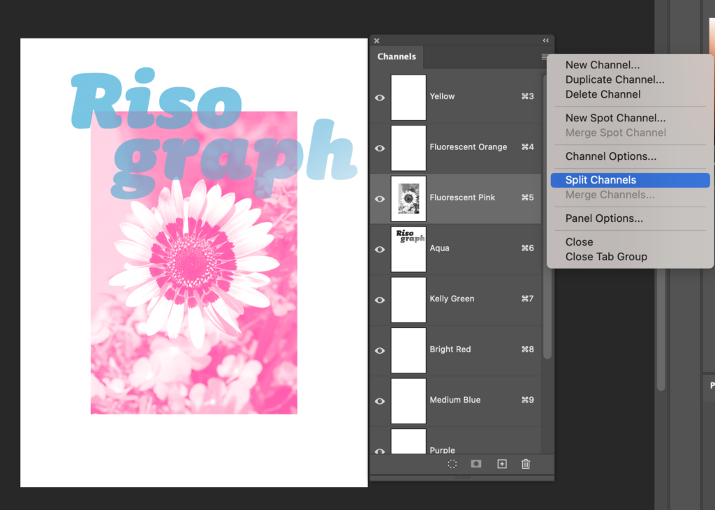
The example above contains blank channels for the colours that aren’t being used…but you can clean things up by deleting unused channels before splitting them (just select them, and click the trash can at the bottom right.)
Another Option: Pantone Colours
If you have the Pantone colour system available in your software, and want to use them as placeholders in your Risograph files instead of these custom spot colours: when you’re adding swatches or channels, choose the colour library “Pantone+ Solid Uncoated”, and use the following numbers for each Riso ink:
Bright Red |
Closest Pantone: 185 U |
Orange |
Closest Pantone: Orange 021 U |
Sunflower |
Closest Pantone: 116 U |
Yellow |
Closest Pantone: Yellow U |
Light Lime |
Closest Pantone: 387 U |
Kelly Green |
Closest Pantone: 368 U |
Hunter Green |
Closest Pantone: 342 U |
Light Teal |
Closest Pantone: 320 U |
Aqua |
Closest Pantone: 637 U |
Medium Blue |
Closest Pantone: 286 U |
Midnight |
Closest Pantone: 296 U |
Purple |
Closest Pantone: 2685 U |
Violet |
Closest Pantone: 265 U |
Fluorescent Pink |
Closest Pantone: 806 U |
Coral |
Closest Pantone: 177 U |
Flat Gold |
Closest Pantone: 1245 U |
Brown |
Closest Pantone: 7526 U |
HD Black |
Closest Pantone: Black U |
We got these approximate Pantone numbers from stencil.wiki , who have an excellent list online of other Riso ink colors that exist, and rough Pantone, CMYK, RGB, and hex matches for each.
Pantone and Risograph are two totally different companies, and two different systems of colours and inks, so these numbers aren’t official colour matches for Risograph – but they do make good placeholders for Riso files.