
Have you downloaded our custom set of studio spot colours for Risograph, or set up Pantone colours in your file? Once you have either of these sets of special colours in your InDesign or Illustrator swatches, it’s easy to apply them to text or vector shapes – but it’s not as obvious how to use them on pixel-based placed images like photographs or illustrations. Let’s go through the steps!
Open your image in Photoshop.
The image will need to be saved in Grayscale mode. Go to Image > Mode > Grayscale in the menu.

If you’re starting with a colour image: you can also try Image > Adjustments > Black & White first, before Image > Mode > Grayscale, to customize how it’s converting your colours to gray.
You should now see the word “Gray” in the tab next to the file name.

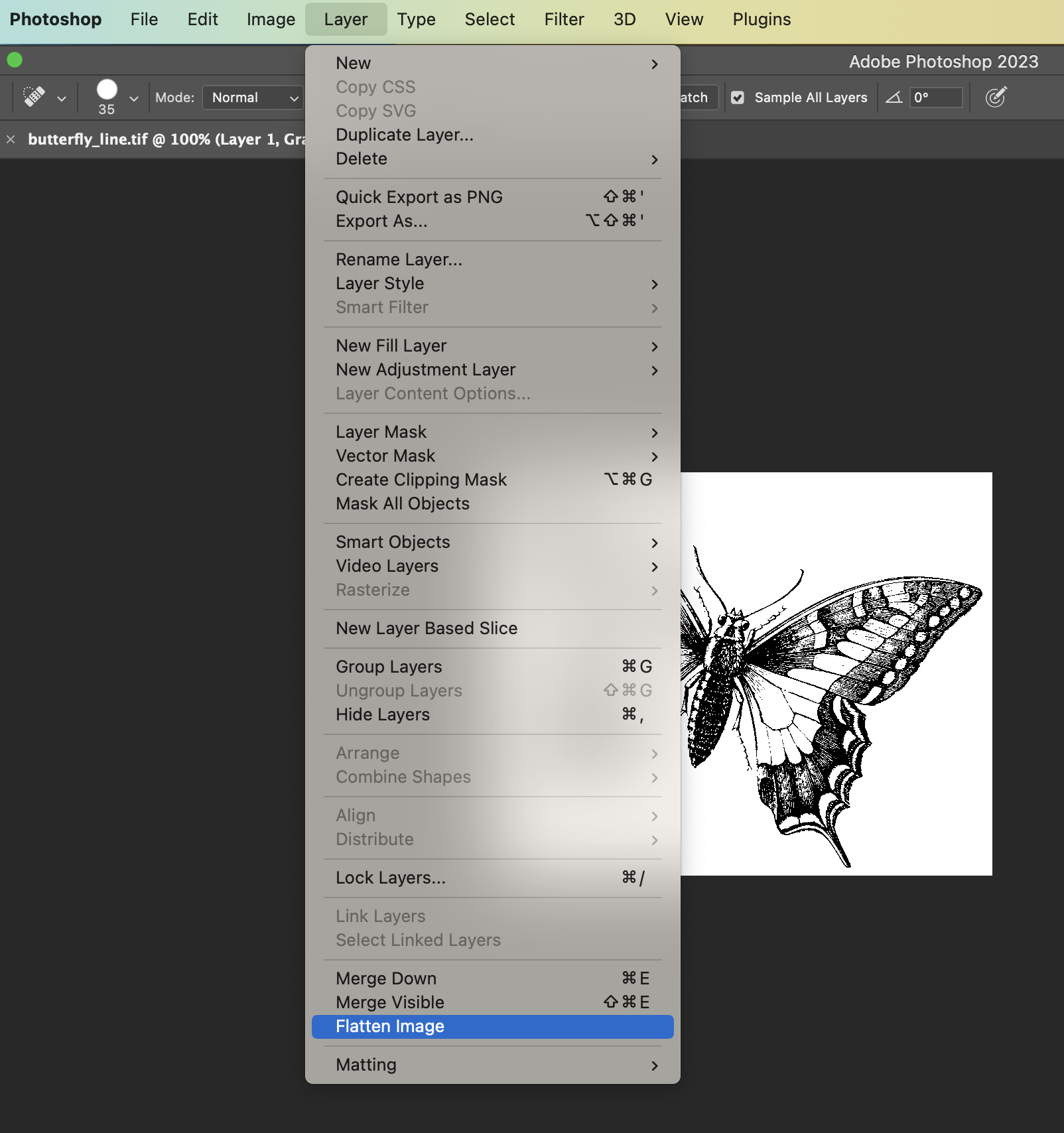
It’s not enough that it’s Gray – for this to work, it also has to be flat, and saved as a specific file type. Go to the Layer menu, and Flatten Image.
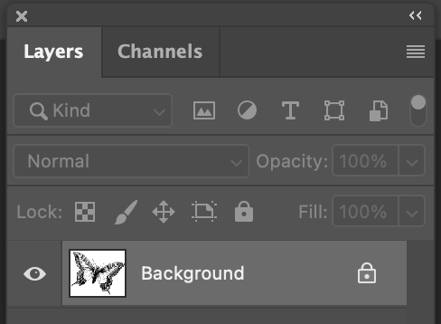
To double check if the image is properly flat: look at Layers (Window > Layers.) Your file should now only have one layer, called “Background”, and it should be locked.
You should also not see any of the checker pattern that represents transparency. If it’s all flattened, any transparent areas of your grayscale image should just look white.
Save As…
Once your image is gray and flat, go to File > Save As… and choose either “Photoshop” or “TIFF” as the format. These are file types that support the true grayscale colour mode, and will work for applying colours to this image in InDesign or Illustrator.
In Illustrator or InDesign
Place your grayscale image in your document (File > Place, or drag the file in.) To check that the mode is grayscale, open Window > Links and take a look at the image information.
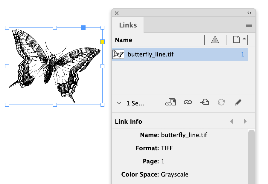
If it says Gray or Grayscale, it’s good and ready to use. If it says RGB or CMYK, it’s not properly saved in gray mode (even if the artwork looks black or gray) – open it up in Photoshop, convert it to gray, and save it again.
Now, select the image content, not the container frame (one way to do this is by clicking it with the white arrow, the “direct selection”), and you’ll see that it has a black fill colour. You can change that colour to any of your swatches, and it will replace black and gray!
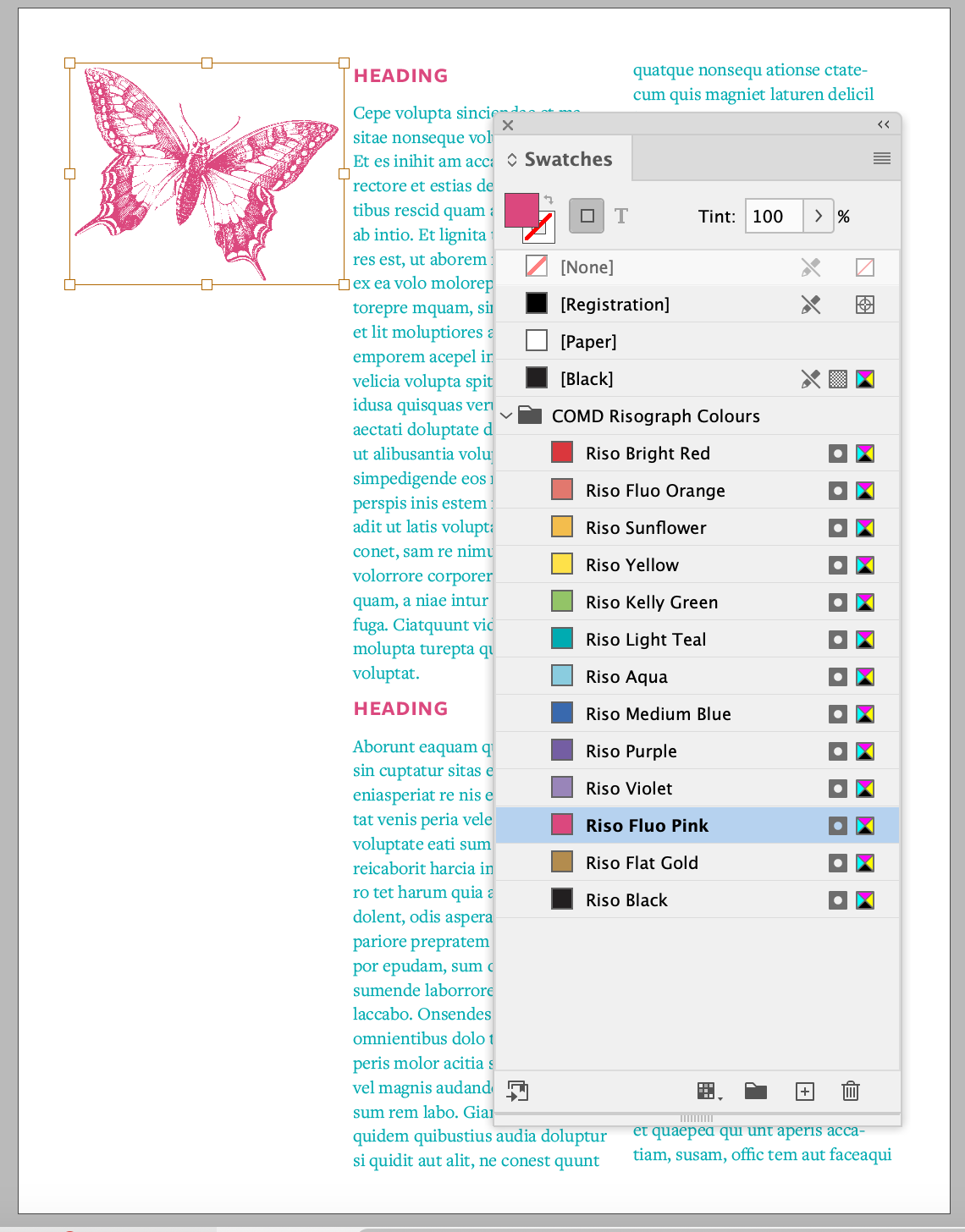
If you apply the colours to the frame or container instead of the image content, it will apply to the white parts of the image, and act like a background colour.
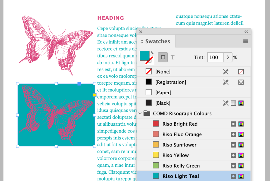
If you want two inks to overprint and overlap on purpose, just set the blending mode to “Multiply” (either for both of them, or just the top object.) In InDesign, this is in Window > Effects, and in Illustrator it’s in Window > Transparency. You can also create overlap effects using Opacity.

If you don’t set up overprints with opacity or blending modes, it will instead treat the overlap as a “knockout” when we generate the separation for print (leaving a white gap in the bottom shape.)
That’s it! Using spot colours with placed files is a great way to set up more complex layouts and publications that need to consistently use the same Riso colours for both text and images.
When you’ve got everything set up with your ink colours, you can either bring your working .indd or .ai file to a COMD tech appointment, or take a look at how to generate your own separations for printing.