
Let’s set up a consistent 2-ink spot colour file in InDesign using our studio’s Risograph swatches! This tutorial corresponds to a project in COMD 310, Spring 2026.
First of all…this is only one of many possible methods for a Riso colour separation!
Spot color swatches are a great way to set up Riso colours, especially for complex multi-page publications in InDesign where we have both type and images and want to be able to check every detail for a clean consistent result, and have full control over our colour separation choices. It’s also good practice for working with other spot colour systems like Pantone.
However! This isn’t the only method for building great Risograph separations. All we need in the end is a grayscale page for each ink colour, however you get there. For a tour through your other options see these two posts:
Keep reading here to learn about the spot colour method!
Download the sample files and the swatches
We have the sample file for this tutorial available on Moodle. You’ll also want to download our studio Risograph swatches.
Loading the swatches in InDesign
First, let’s open the “separation_starting.indd” demo file. If you have trouble opening the .indd, try the .idml version in the same demo folder.
Everything here is in black and white to start, but we want to set it up for 2 ink colours. We could just sort these black and white pieces onto two black and white layers, and use those as our print files…but using spot colour swatches instead lets us see the 2-colour design while we’re working, and plan easily for overlaps and layering.

Open Window > Swatches, click the menu in the top right corner of Swatches, and choose Load Swatches. Now, find the “COMD Risograph Swatches” folder that you downloaded from the Riso Moodle.
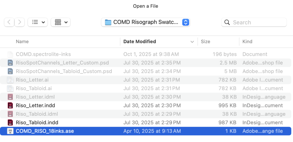
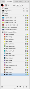
Choose the .ase file. That’s an “Adobe Swatch Exchange” file that can be used the same way in either InDesign or Illustrator.
Nice! Our .indd file now has a set of special swatches that represent our studio’s Risograph ink colours. Notice that they have a different icon next to them than the default CMYK colour: they’re set up as “spot” colours not “process” colours, which means the software can treat each of them as a different ink for a customized print file setup.
We want everything in this file consistently assigned to our two chosen Riso colours, and only those colours.
Changing fill colour

Let’s start changing colours to Riso Coral and Riso Brown. The title text and rectangles are vector shapes with fill colours, so we can just select them and change the fill colour swatch. Notice how the shades of gray keep the same Tint percentage even when changing swatches.
Cleaning up the unused swatches
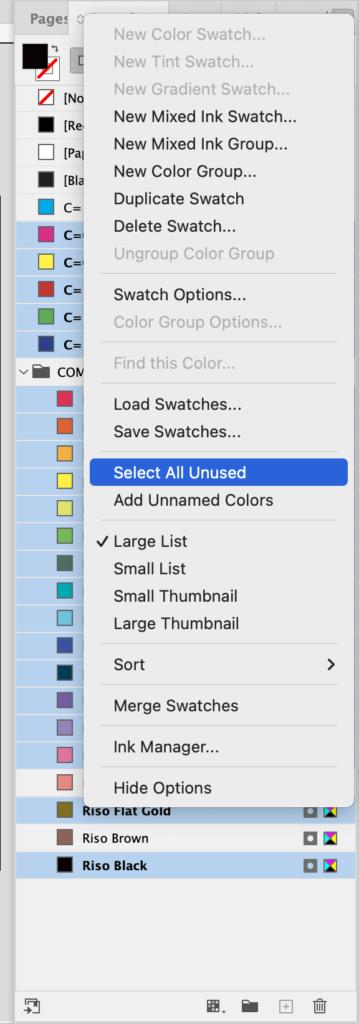
That’s a long list of Riso swatches, and we’re actually only using two, Coral and Brown. Let’s clean things up by getting rid of the rest of them. Click the menu in the top right corner of Swatches, then Select All Unused. Then, click the trash can at the bottom of Swatches.
If any other stray swatches are left, you can trash them individually, and “replace with” Coral or Brown if a window comes up asking whether to replace.
The swatches in the brackets at the top always stay there, and that’s fine. For a spot colour file, avoid that [Black], since it’s not one of our final ink colours. [Registration] is different: it looks like another black swatch, but what it actually does is combine every ink colour in the file.
Applying a swatch to a grayscale image
Open Window > Links, and take a look at the info for the placed photo, “ecu_gray.psd”. The colour space is Grayscale, which means we can apply colour swatches to this image in InDesign.
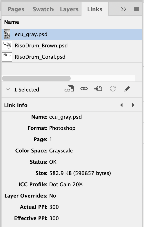
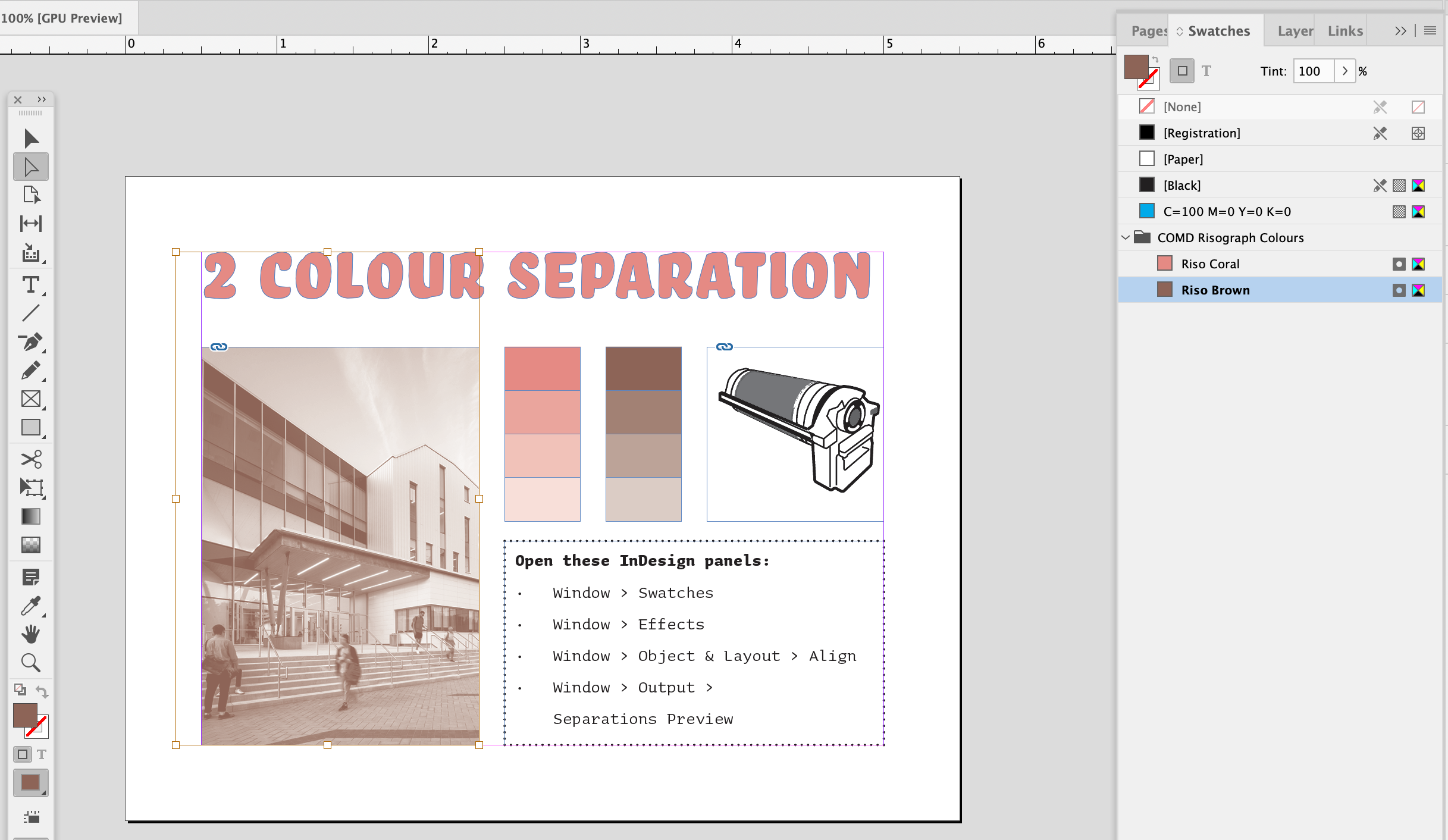 Select the image content, not the frame, and a black fill should appear in Swatches. Now, choose another swatch to replace black with one of the Riso colours! You can select the content by clicking on the image with the white arrow (direct selection), clicking on the image by the circle icon that appears in the center, or going to Object > Select > Content in the menu.
For this to work, the placed image needs to be in Grayscale mode, flattened, and saved as either .psd or .tif. We have a more detailed tutorial about this method here!
Applying a swatch to stroke and text
For the text frame and its outline, we’ll need to pay attention to which part of the object is selected at the top of Swatches:
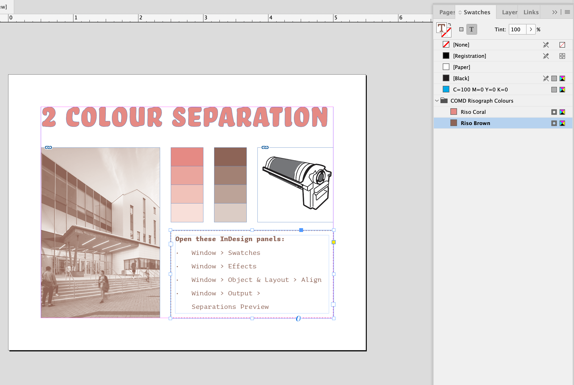
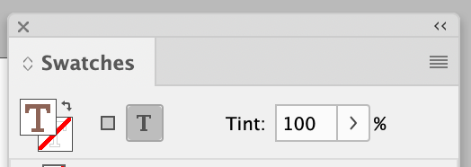
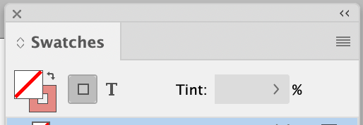
Applying the spot colour swatches works the same way: you just need to pay attention to whether you’re choosing the fill colour or the stroke outline colour, and the container or the text inside.
Layering two images
Our last graphic, the illustration of the Risograph drum, is actually a separate gray file planned for each ink colour! We can move them apart for a closer look:
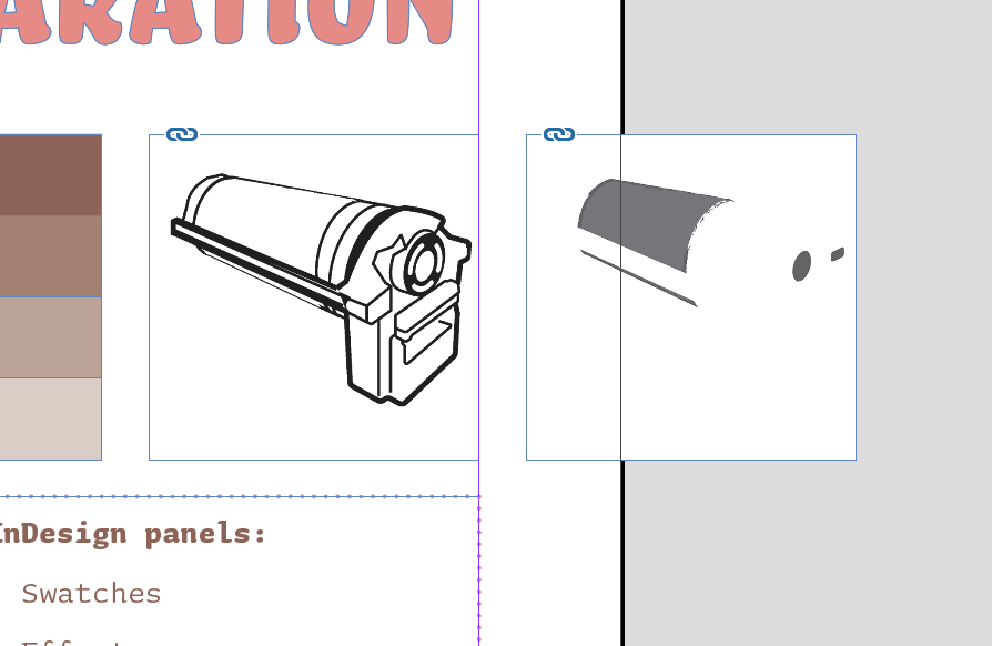
Applying the swatches works the same way as it did for the photo: select the content, and choose the Riso Brown and Riso Coral swatches.
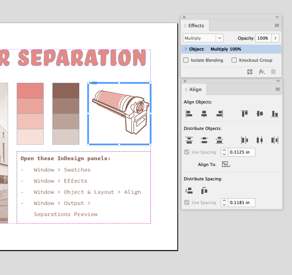
If we want these two inks to layer for printing, and the white space to be treated as transparent: open Window > Effects, and change the blending mode from Normal to Multiply. You can also use the Align tools to help the two pieces to line up perfectly.
Checking the separations
Everything on the page should now be assigned to our two swatches, so let’s do a final check to make sure it’s right! Open Window > Output > Separations Preview.
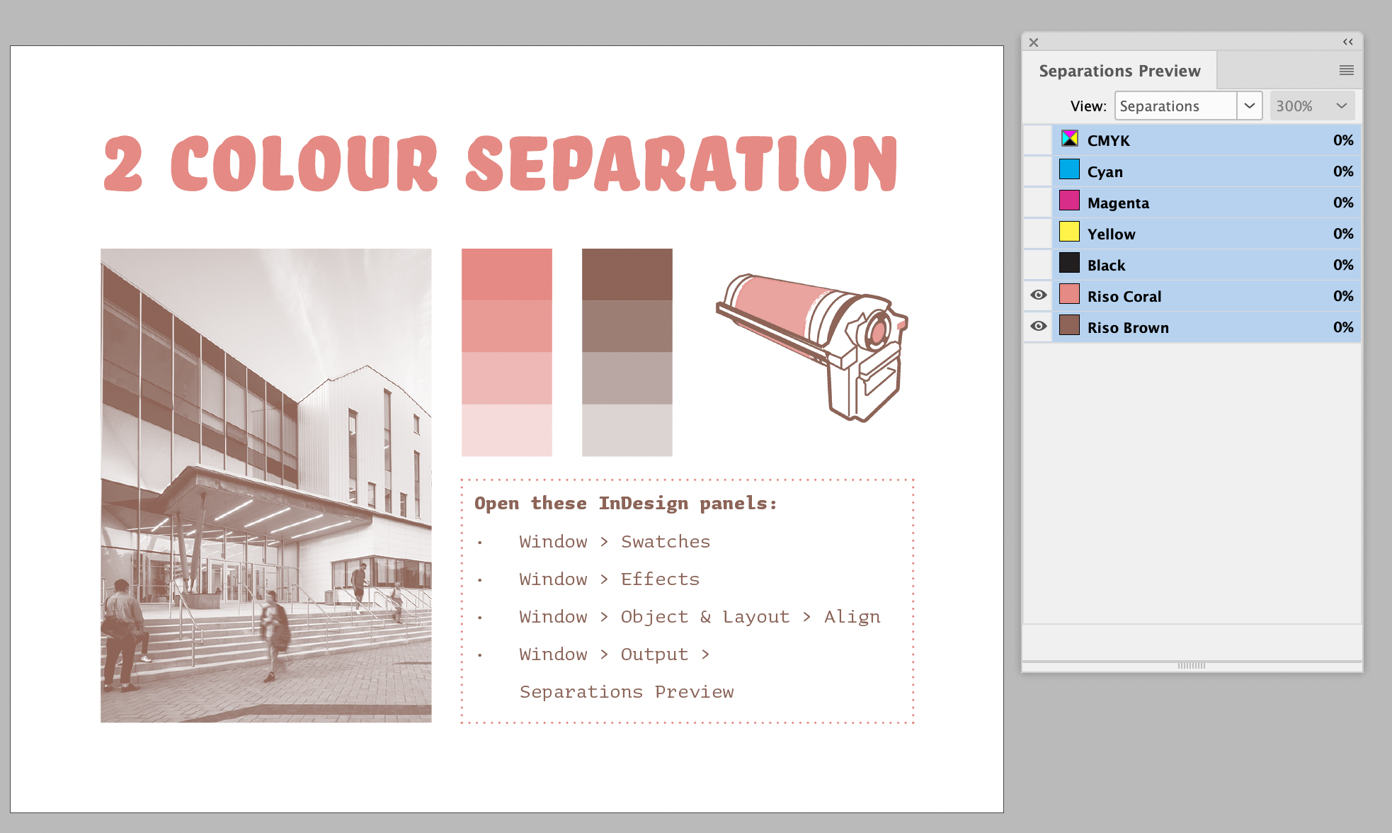
This window shows every colour that represents a separate ink. Change “View” to Separations, and turn off the eyes for the 4 CMYK inks, so that all that’s left is Riso Coral and Riso Brown. We can also look at each ink separately.
Saving spot colour files
If you’re ever asked to provide an InDesign .indd that includes spot colours, this is it: just save or package!
We can also export a PDF that includes both spot colours. Export as “Adobe PDF (Print)”, and, in the PDF settings under Output, make sure it’s set to No Colour Conversion.
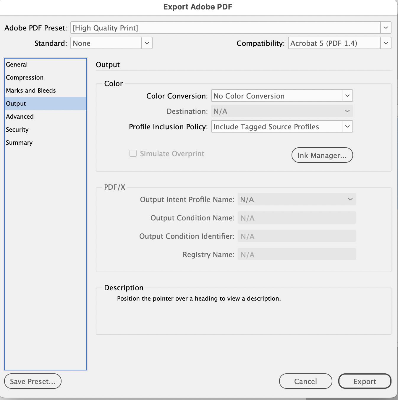
Some of the standard PDF presets will convert all the colours to CMYK or RGB, and that means our special spot colours will be lost. Using “No Colour Conversion” instead means it will keep Riso Brown and Riso Coral in the file. This PDF could be placed inside another InDesign or Illustrator file using the same spot colours, and it would match and be usable for the same spot colour print job.
Saving black and white separation files
For our final Riso print files, we’re going to need to save a separate grayscale file for each separation, and there’s a special way to do this using “Print” (not Save, or Export. It’s a little weird.) We have instructions here.
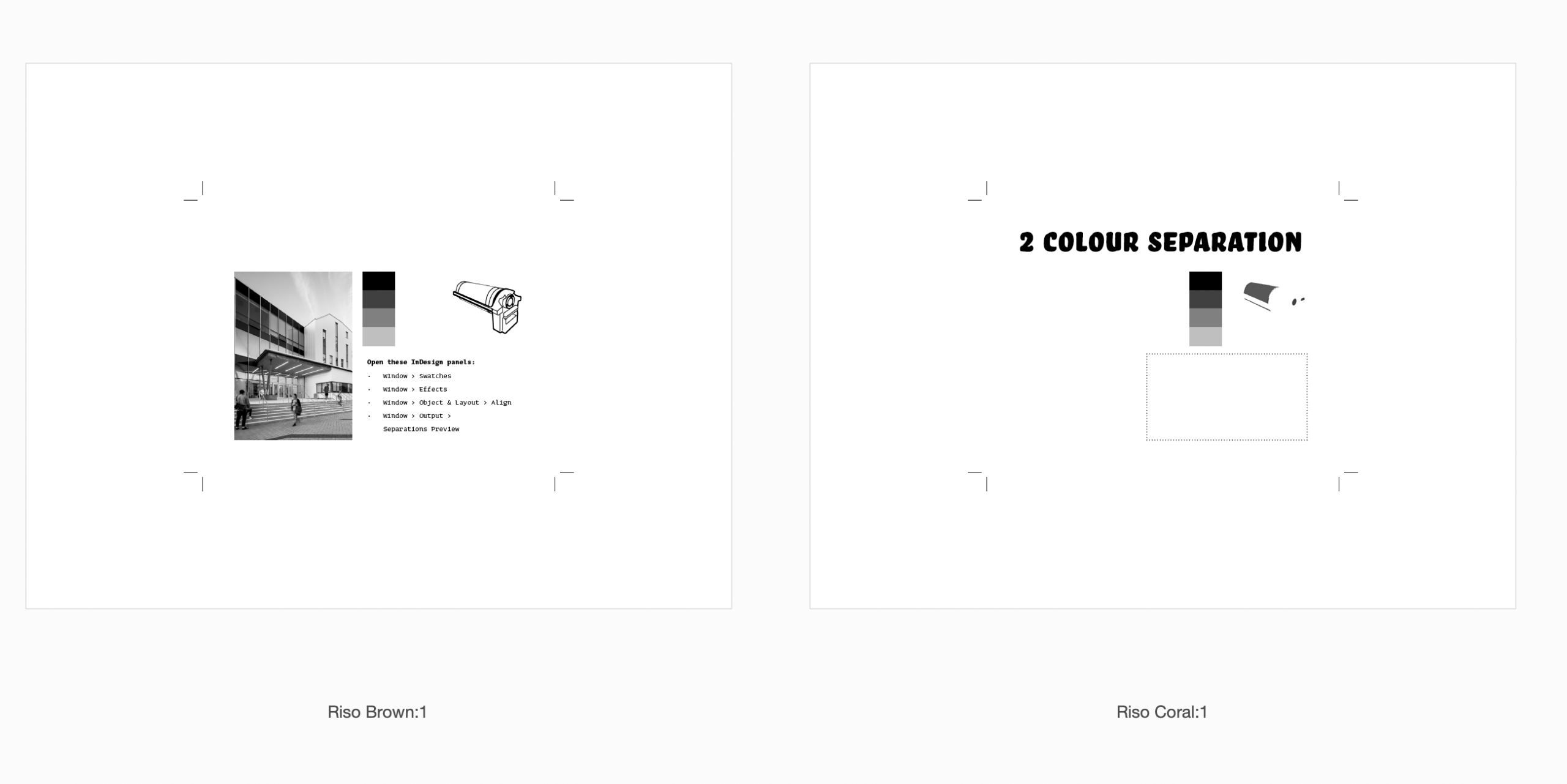
Here are my final separated print files, viewed as 2 pages in Acrobat. This method gives you the ink colour names in the page numbers, which is nice. These two files are ready to become Risograph master stencils for Brown and Coral. I saved these with crop marks on letter size pages…but if this was an actual print file, I could save money and get a more efficient print by putting multiple copies of this small design on letter or tabloid size paper. For the COMD 310 project, everyone’s pages will be printed together in the same 2 ink colours on one 11×17 sheet.