
This tutorial corresponds to an in-class demo for COMD 200 (last updated Fall 2026.) Let’s get started with Photoshop! We’re going to talk about how pixel-based graphics work, size and resolution, colour, and how to edit non-destructively with masks and adjustment layers.
Demo Files
The sample images for this demo are available to download on the class Moodle. It’s a folder contained in a .zip file. If you’re using a Mac, just double-click it to open it, and if you’re using windows, choose “Extract”. Image credits and source info are included in the folder, and also at the end of this post.
Pixels, Size, and Resolution
Let’s open the bird image first:
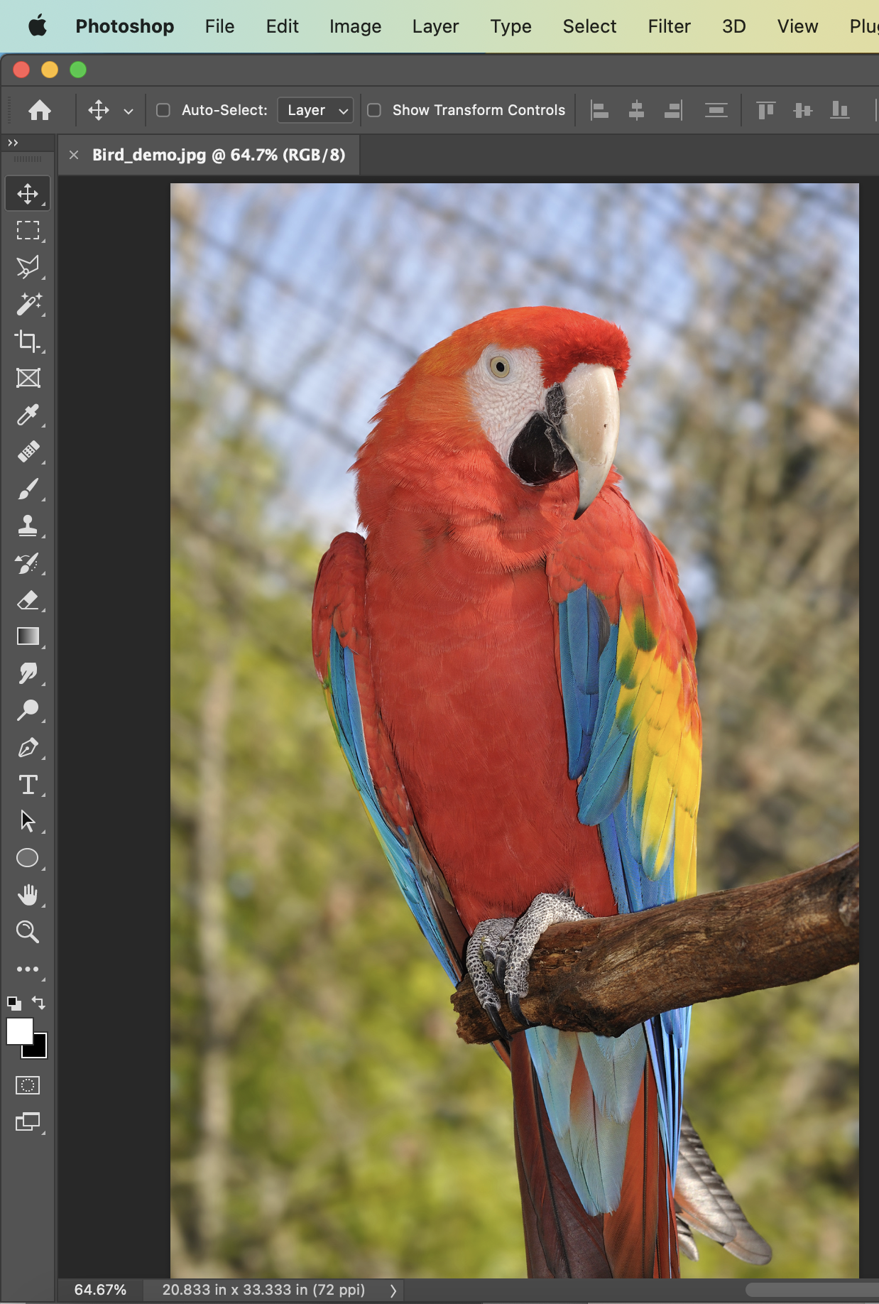 This is a raster file, which mean the image is made up of a grid of tiny squares called pixels. If we zoom in really far, we can see them:
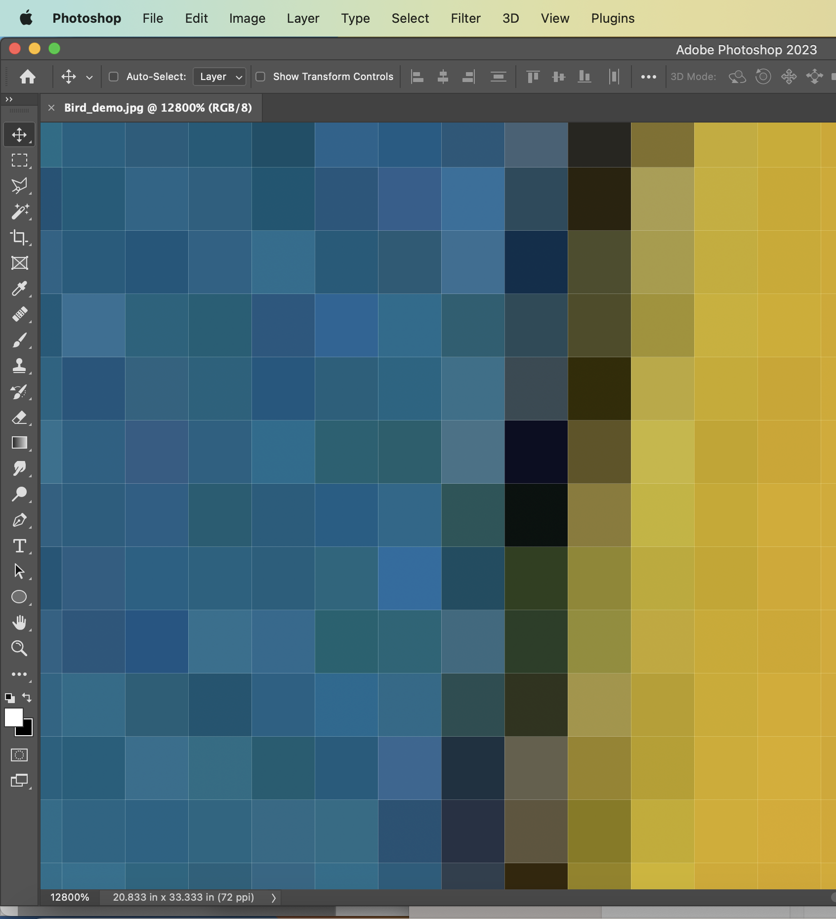
We can see a zoom % and some size information on screen here – but if we’re working on a print project, we can’t really rely on how it looks on screen at “100%” to judge the actual size, and how it will look in print. We need to see more detailed information, so we’ll go to:
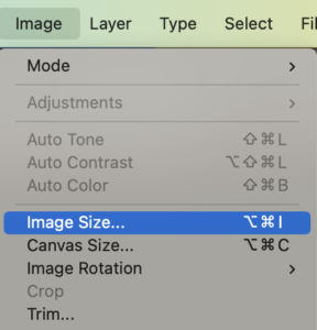
Image > Image Size in the menu
That’s “Image Size”, not “Canvas Size. Image Size is for scaling and resizing the whole image while looking at the resolution. Canvas Size is for cropping or extending the size of your Photoshop document (so, making the size smaller there cuts parts off, and making it bigger adds extra blank space at the sides)
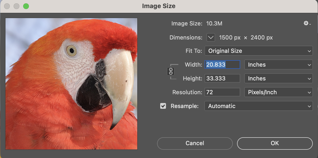 In Image Size, we see:
- Width and height in pixels
- Width and height in inches
- Resolution (pixels per inch)
Higher resolution images (more pixels, and more pixels per inch) mean the image can show finer, higher quality details, and print bigger without losing quality. There’s more information about how resolution works here.
We want to pay attention to whether this checkbox called Resample is on or off.

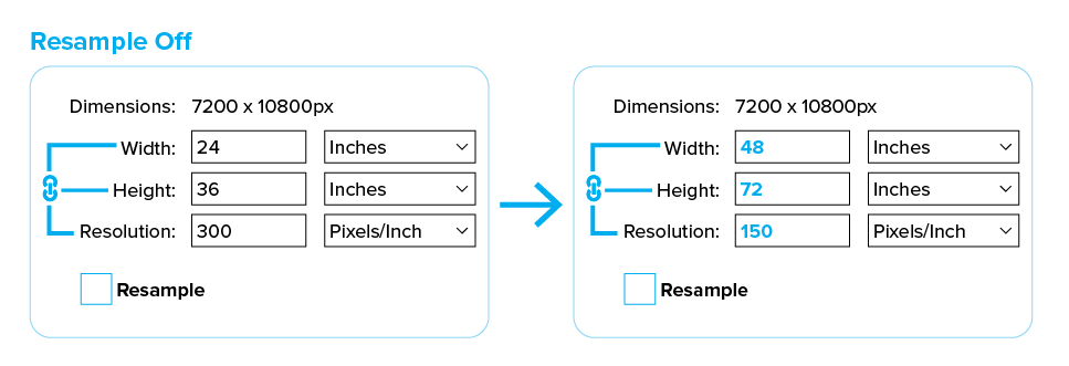
If Resample is on, then changing the numbers for size or resolution will change the actual number of pixels in the file. If you try to use that to make it bigger, it will need to make up new pixels that weren’t in the original image information when the camera captured this photo, and the result can lose quality and look blurry. Resample is fine for making images smaller, but usually not for enlarging.
If you make a mistake in this window: holding down Option or Alt on your keyboard turns the “Cancel” button into “Reset”
We want Resample off for this. If it’s off, the total number of pixels doesn’t change – we’re just rearranging how many pixels are per inch (that’s the resolution.) This image started at 72 ppi, which is ok for on screen, but not for print. Let’s make it 300, the minimum for a standard high quality print.
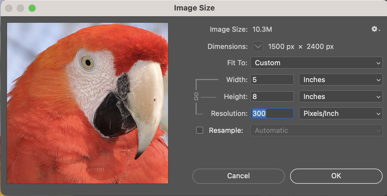
Now we can see: the biggest that this image could print on a regular printer, without losing quality, is 5 by 8 inches.
If you’re printing a large format poster or banner (at the DOC at school, that means choosing Large Format Toner), you can actually get away with lower resolution, with numbers in the 100s or 200s. That’s because those prints are meant to be seen from farther away, so it’s usually fine if the print quality looks a little grainy up close. The next time you see really big advertising poster in a public place (like in a train station or a movie theatre), if you look really close, you’ll probably notice that the images don’t look as high-resolution as the standard for high-quality art prints, or smaller formats like books and magazines.
Colour Modes
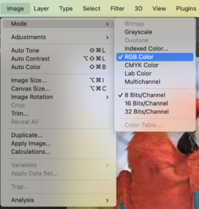 We won’t look at every possible colour mode in this demo, but we’re going to take a quick look at one important difference: RGB mode vs. CMYK mode. If you look at the tab with the file name, or go to Image>Mode in menu, you can see which mode your file is currently in.
RGB: A mode based on the way colours work on screens. All colours are made of combinations of Red, Green, and Blue light.
CMYK: A mode based on the way colours work in printing. All colours are made of combinations of Cyan, Magenta, Yellow, and Black (technically, the “K” stands for the word “key”), which are the four inks or toners in standard full-colour printing.
RGB is capable of a bigger, brighter range of colours than CMYK. If your project includes on-screen graphics where you want to use the most wild-looking neon colours possible, choose RGB mode! However, if your project is for print, or both: you can definitely work in RGB, but if you’re using very bright colours, some are actually impossible to print (at least with a regular CMYK printer), and you might be disappointed about how the prints come out.
We could switch this file to CMYK – or, we can actually check which colours in an RGB file are outside the range (called the “gamut”) for print.
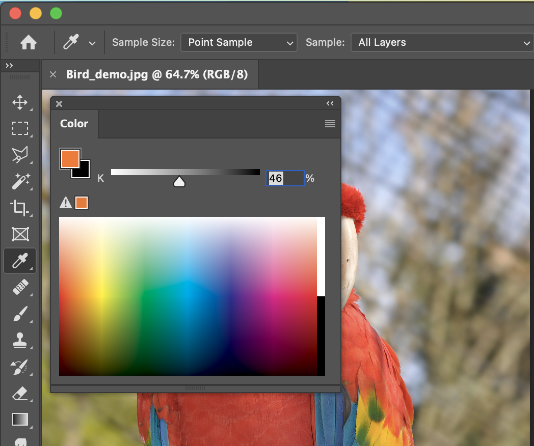
If you sample colours with the eyedropper tool, and look at the Color panel, or the color picker, there will be a little warning triangle whenever it thinks a RGB colour is outside the print gamut.
We can also turn on View > Gamut Warning, to get this view where the areas outside of the gamut are highlighted in gray.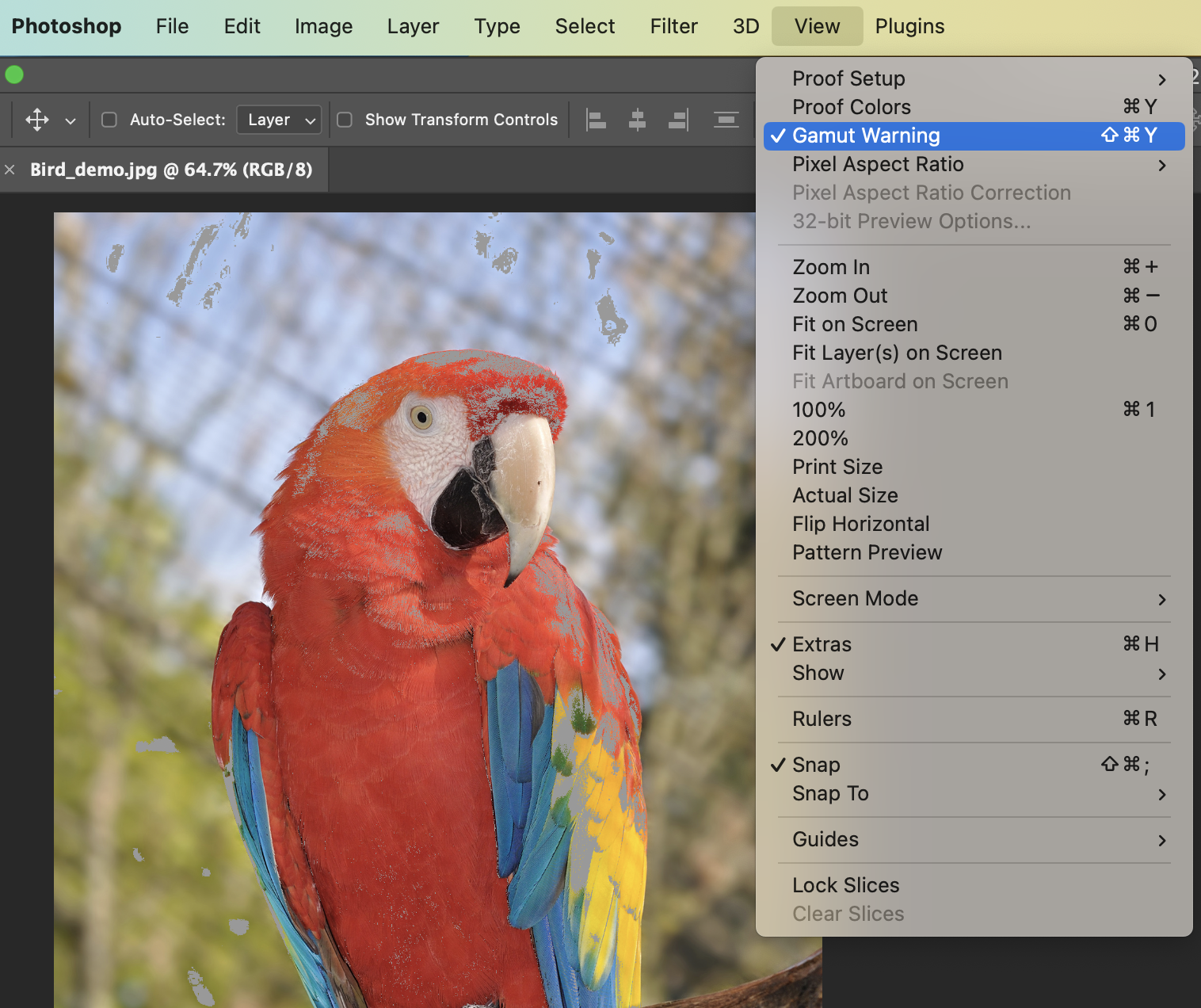
Save As…
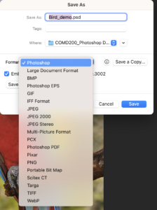
This original file is a .jpg image. The JPG (or JPEG) format is lossy, which means that it sacrifices some image quality every time you save it, to try to get the file size smaller and more efficient. It’s a good enough format for final web or screen based images, but it’s not ideal for print, and it’s not a good idea to use it for a working file in progress.
Let’s go to File > Save As… and choose Photoshop (.psd) as the format. TIF and PDF can also be good choices for print files and working files. If you choose PDF, the PDF settings determine whether it loses any quality or resolution, and whether it keeps all your Photoshop layers.
Layers and Non-Destructive Editing
Let’s open our second image file, the oranges.
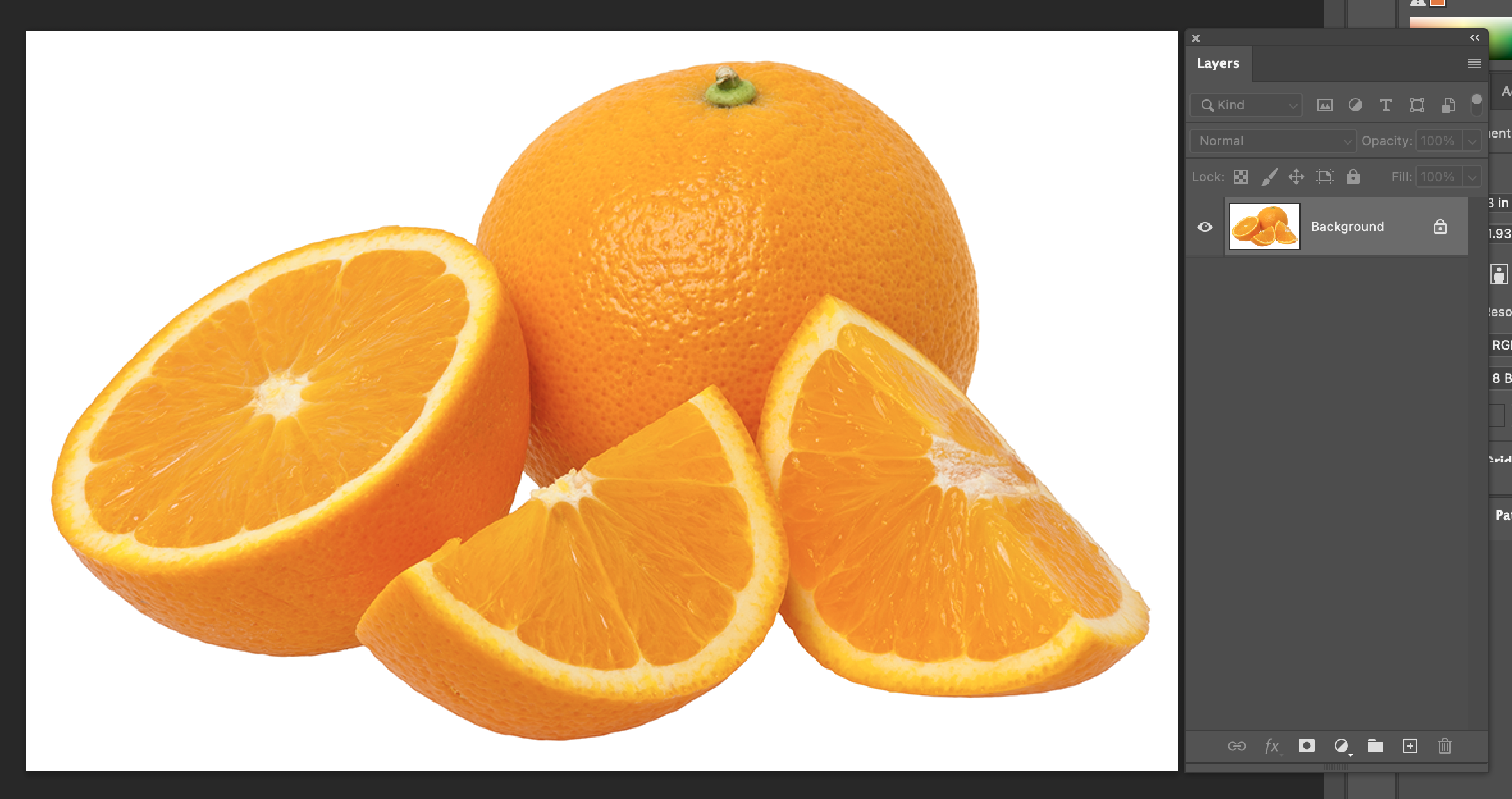
We want the Layers panel (Window > Layers) open. This image is flat, which means it only has one layer, called “Background”, and it’s locked.
We’re going to be working with multiple layers here, so first we want to unlock this one. Double-click on the Background layer to unlock it, and name it “Oranges”. The lock icon is gone now.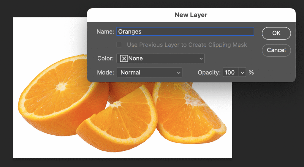
Let’s make a second layer. Click the plus sign (+) at the bottom of Layers.
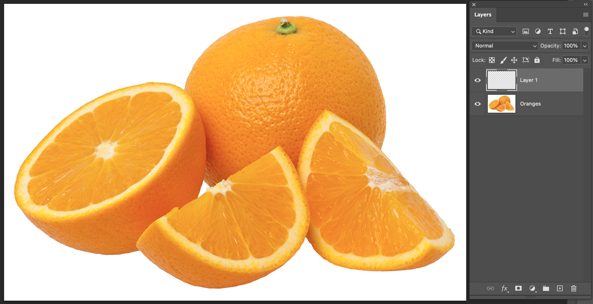
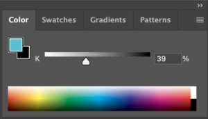
Now we’ve got another layer called Layer 1, but right now it’s empty. Let’s fill it with a colour. There are many ways to do this, but here’s one that shows a useful shortcut. Click anywhere in the rainbow at the bottom of the Colour panel to pick out a nice blue (the exact colour doesn’t matter for this demo), and then, with our new Layer 1 chosen in the Layers panel, press Option Delete (Mac) or Alt Delete (Windows) to fill.
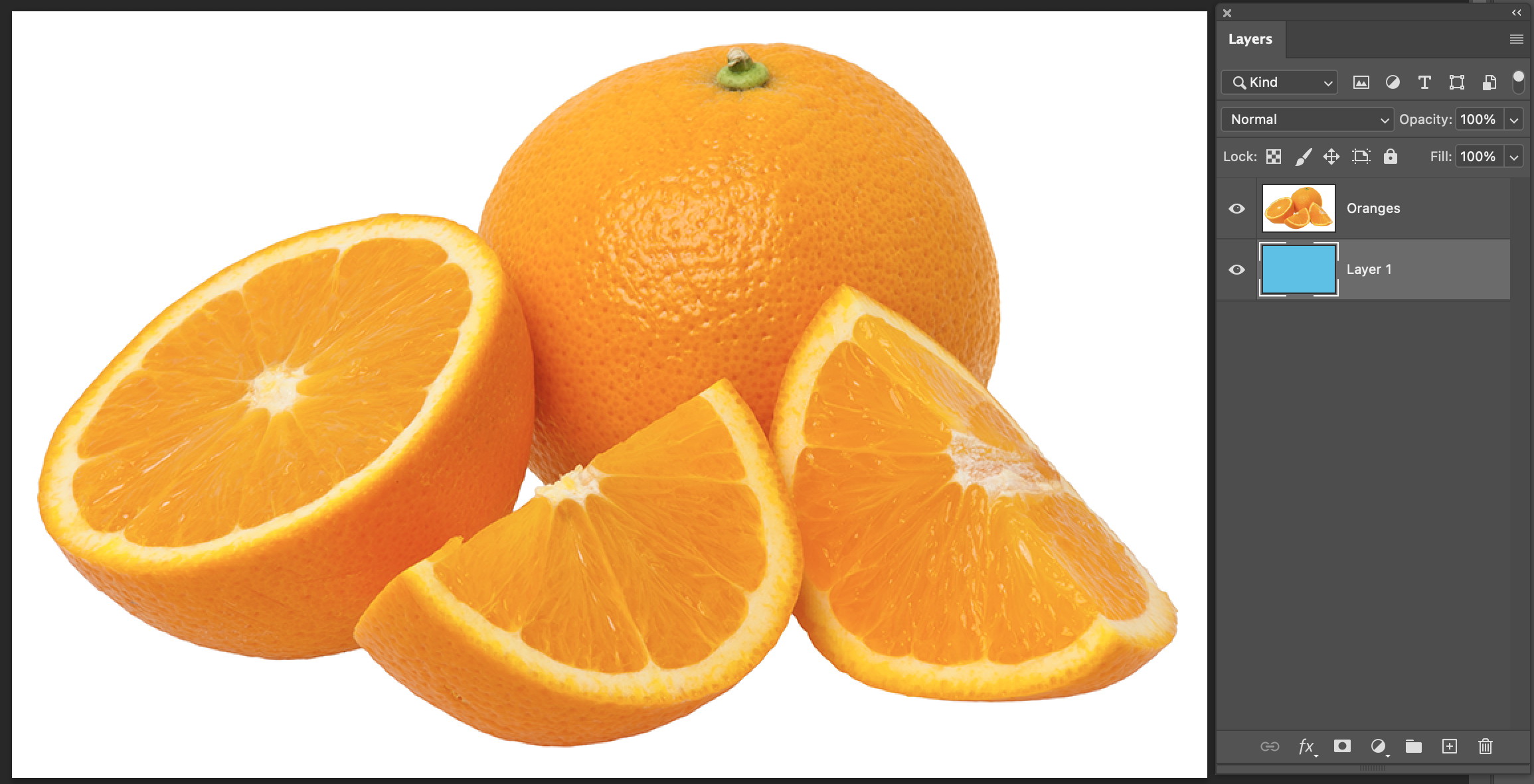
Now, looking at Layers, we can see that blue in the thumbnail preview for Layer 1…but not in our actual artwork, because it’s hidden behind the solid white background of those oranges!
We could use Opacity and Blending Modes (under “Normal”) at the top of Layers to affect how these two layers look together…
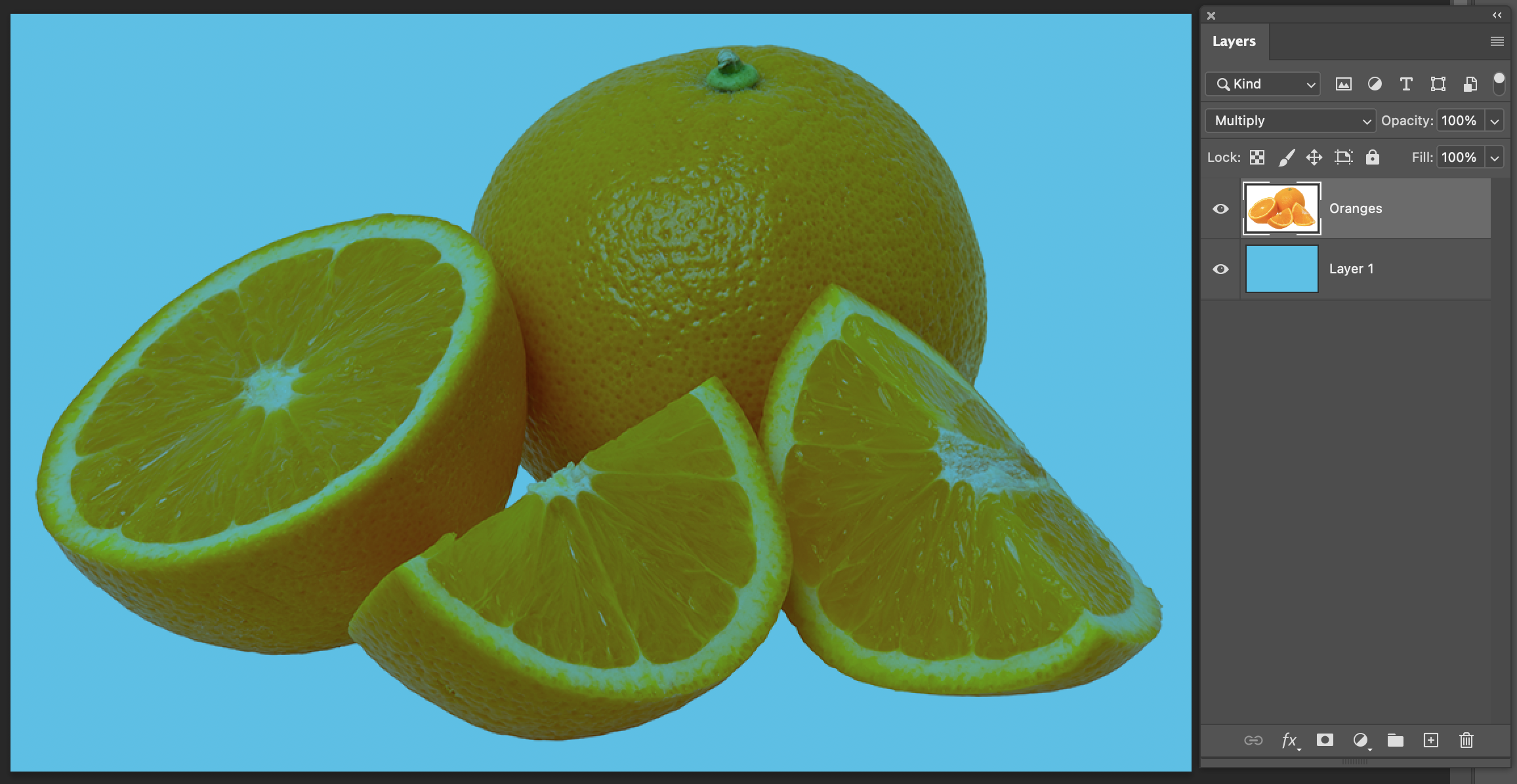
…but using that method to turn the white background transparent also affects the colour of the oranges, with the orange mixing with the blue. That’s not what we want.
We can also move the solid “Oranges” layer around to see the blue showing underneath, but that’s not what we want here either:
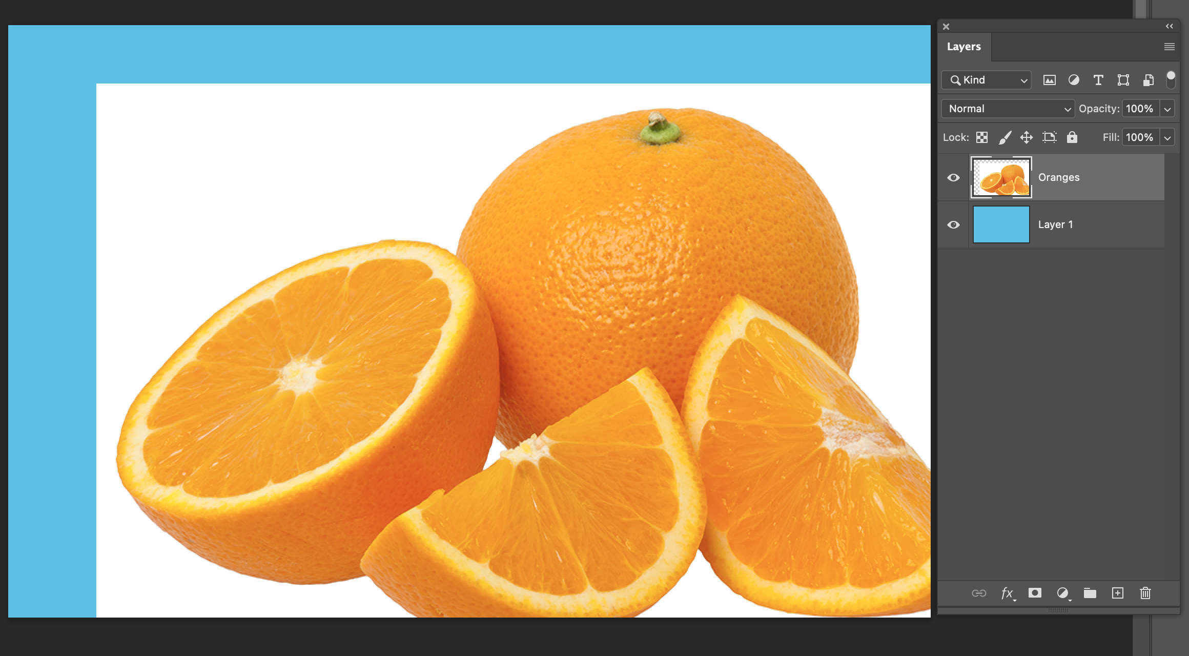
To get those solid-looking oranges on a different background than their original white, we’re going to need to do a selection and cutout, and we’re going to do it as non-destructively as possible.
Non-Destructive Editing
In a raster image file, it’s possible to make destructive changes – that means changes to the pixels that aren’t reversible unless you undo, go backwards in the file history, or open an earlier saved version. Whenever possible, it’s better to work with non-destructive methods. That means we won’t get stuck with permanent changes we might not want, and we can keep going back and adjusting things while we work.
Destructive:
- Directly erasing and deleting pieces
- Applying adjustments directly from the Image menu
- Sizing your image or layers to be smaller (less pixels), then saving without keeping a copy at the original bigger size.
- Flattening your file and saving, without keeping a copy that has all your layers intact
Non-Destructive (good habits!):
- Using masks
- Using adjustment layers
- Keeping a copy of your working file at its biggest original size, with all your layers and effects intact, and then saving flat or smaller versions as needed as separate files
- Not in this demo, but still a good idea: Right-clicking layers and choosing “Convert to Smart Object” before sizing them smaller, or using transforms like rotate, perspective, warp, etc. This lets you change the look while also keeping the original at its full resolution in case you need to go back to it (instead of permanently changing the pixels)
To get started with this cutout, first we’re going to need a selection.
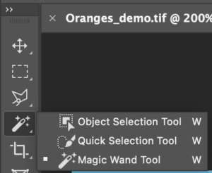
The 3 sets of tools directly below the Move arrows are all selection tools, and they each behave differently. The first two icons, the Marquee and Lasso tools, are for drawing out selection shapes by clicking or dragging. The third set are more advanced: Magic Wand tries to detect similar colours, Quick Selection tries to detect edges, and Object Selection tries to detect distinct objects in your image. If you choose any of these, you should also see a button at the top of the screen that says “Select Subject“, which also tries to do an automatic selection. How well each of these will work will really depend on your image!
For these oranges, Object Selection or Select Subject would do a good job making our selection, and that would be easiest. But, we’re going to do a method that’s not quite as quick and easy, for the purpose of showing a few more useful things in Photoshop.
Let’s choose Magic Wand…and, looking at this image and knowing that it’s going to be detecting similar colours, it’s going to be a lot easier to select that solid white background than to select all the different shades of orange in the oranges. So, let’s click on the white…
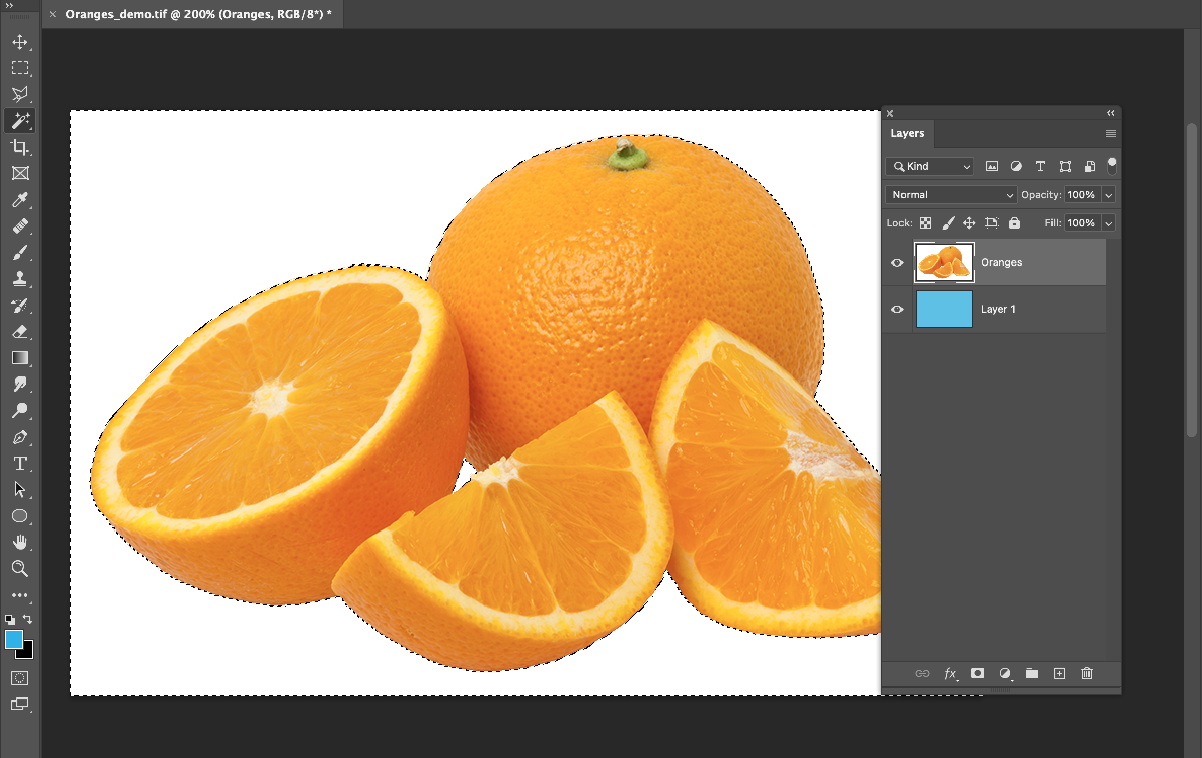
…and then shift click on that little bit of white in the middle that’s not connected, to add it to the selection. While you’re working on a selection, you can shift-click to add to it, and alt/option click to take pieces out.
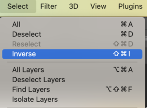 Now all the white is selected – but we actually want the oranges selected, not the background. We can reverse this selection by going to Select > Inverse in the menu.
Now, with that selection around the oranges, click the button that looks like a circle inside a rectangle, at the bottom of Layers.
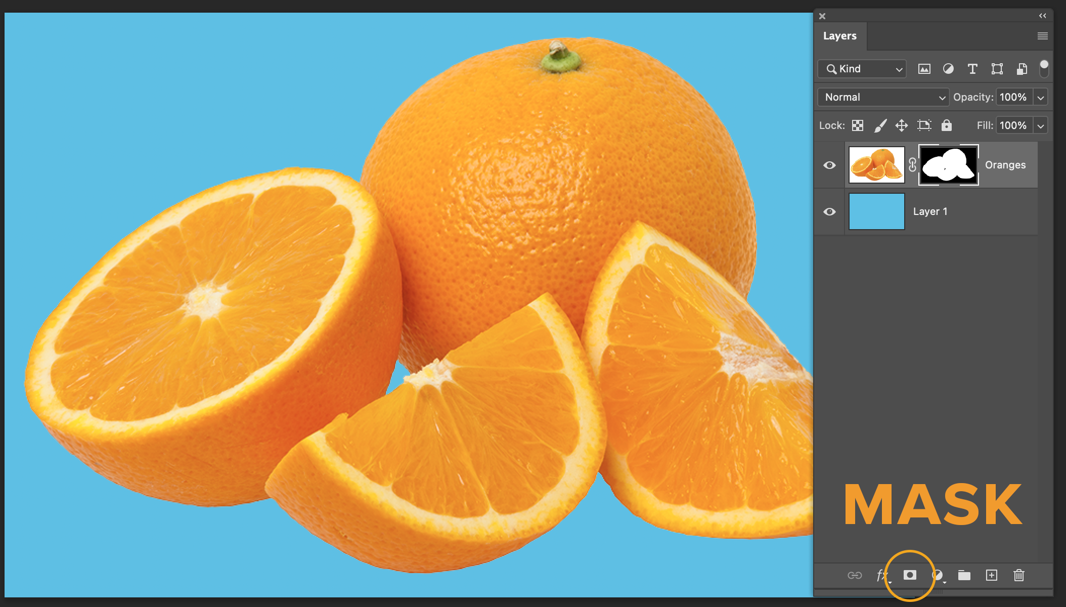
Nice! The part that was selected (the oranges) is still visible, but now the white background is hidden, and the blue underneath is showing.
Masks are like putting a stencil on top of your layer that controls which areas are visible and not visible. This is much better than erasing or deleting, because it’s flexible: if we want, we can turn the mask on and off, edit it, and bring hidden parts back. If you erase or delete directly on the image, those parts will be gone forever unless you Undo, or go back to a previous version of the file.
Let’s take a look at a couple of important things about how masks work in Layers. It’s important to pay attention to which thumbnail you have selected: the actual image content, or the mask. That’s which one you’ll be editing.
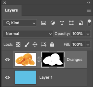
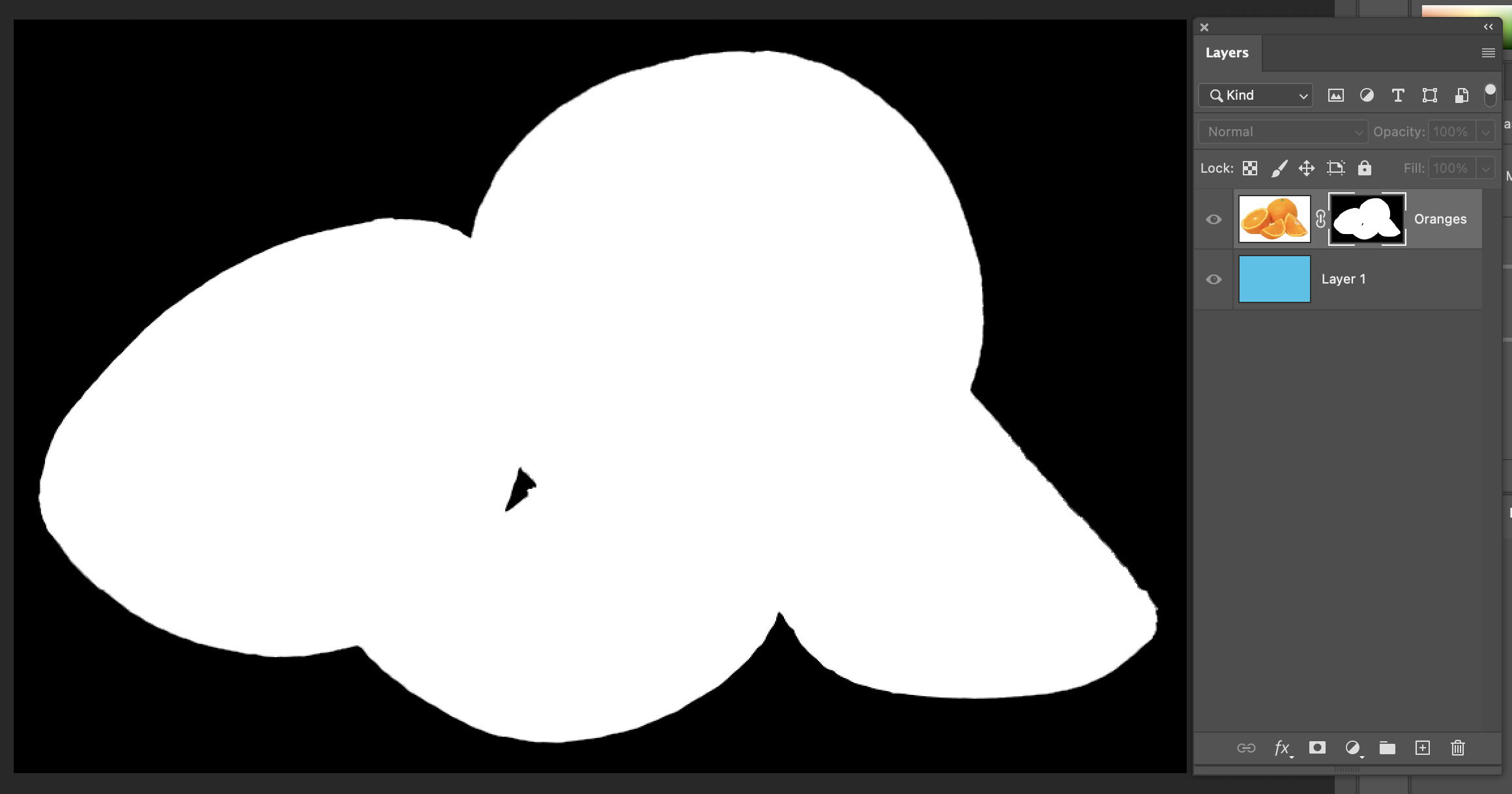
Looking at this, you can see that, in the mask, white represents the parts that are showing, and black represents the parts that are hidden. You can work on the mask with any Photoshop tools that work in black, white, and gray, and shades of gray will work like opacity and be semi transparent.
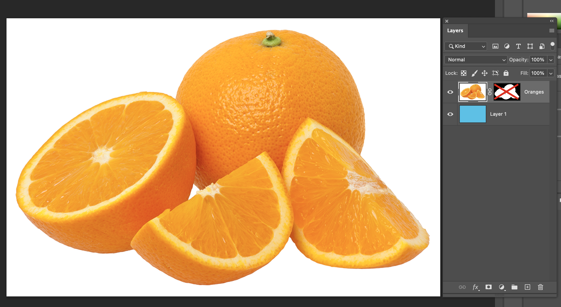
If we shift-click on the mask thumbnail in layers, it hides the mask and we see the original version of the layer:
…and if we option or alt click on the mask thumbnail, we can get a view of the mask instead of the image.
 There’s also a little chain link icon on the layer in between the content and the mask. If that’s on, the content and mask will move and transform (scale, rotate, etc) together. If you click it to turn it off, you can move or transform the content and the mask shape separately.
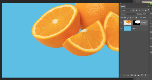
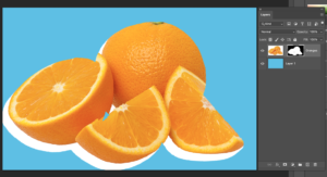
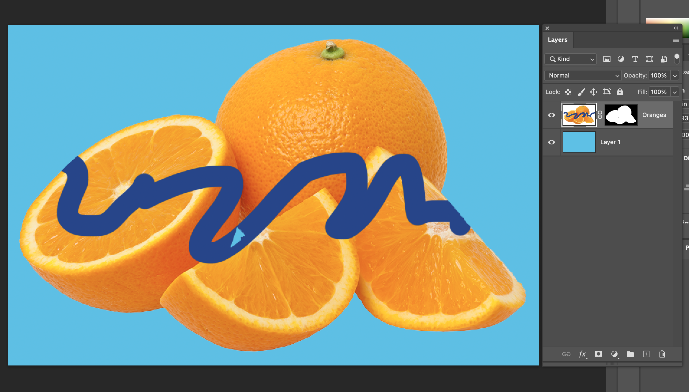
Editing the actual image: If you have the content thumbnail selected in Layers, any editing and drawing that you do will be on the your image, but it will be contained inside the mask shape. Here, I drew on top of the oranges in a different colour with the paintbrush:
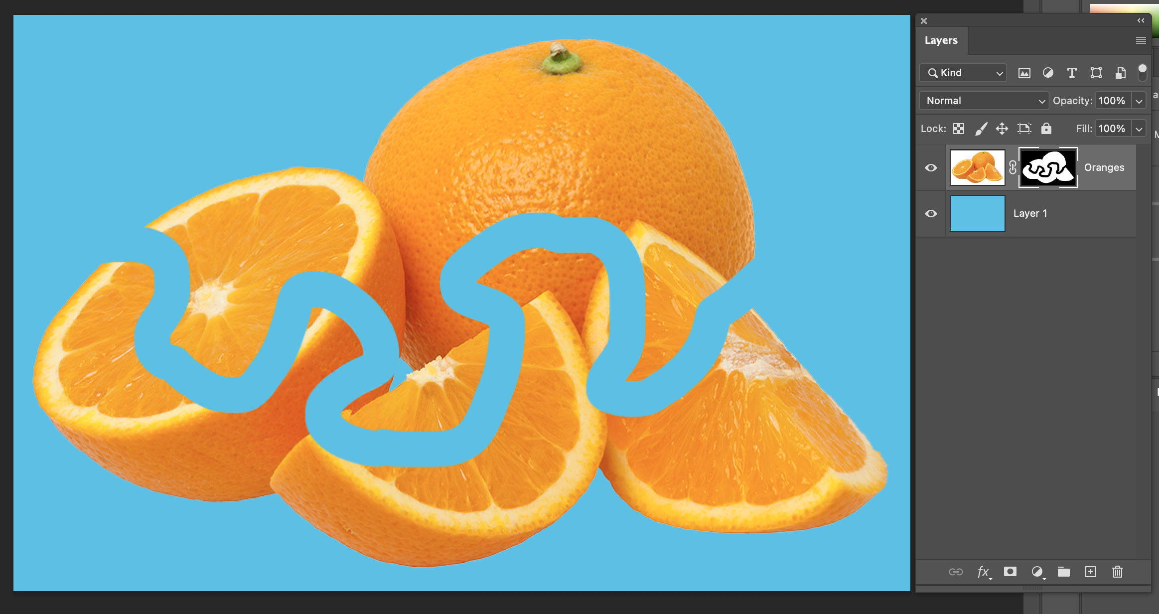
Editing the Mask: However, if you have the mask selected, you’ll be editing the mask shape. Here, I drew on it in black with the paintbrush, which lets the blue background show through. Drawing in white on the mask will paint hidden areas areas back in.
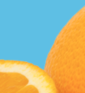
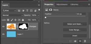 Often, the edge of the mask that you get at first from your selection will be good, but not great, and could use some improvement. If we zoom in really close, there’s a tiny little bit of blurry white at the edge of the oranges. We could work on that mask with drawing or selection tools – but there are also some specific tools for refining edges, if, with the mask selected in Layers, we go to Select and Mask in either the Properties panel or the Select menu at the top. From here, choosing “On Layers” under View will let you see it on top of your other layers, and the sliders under “Global Refinements” make quick adjustments to the entire edge.
This window also has some special tools like Refine Edge Brush and Edge Detection that can be good for trying to get a nice cutout on more difficult images that have soft or complex edges. For now, let’s just try shifting the edge a little bit, and then exit this window.
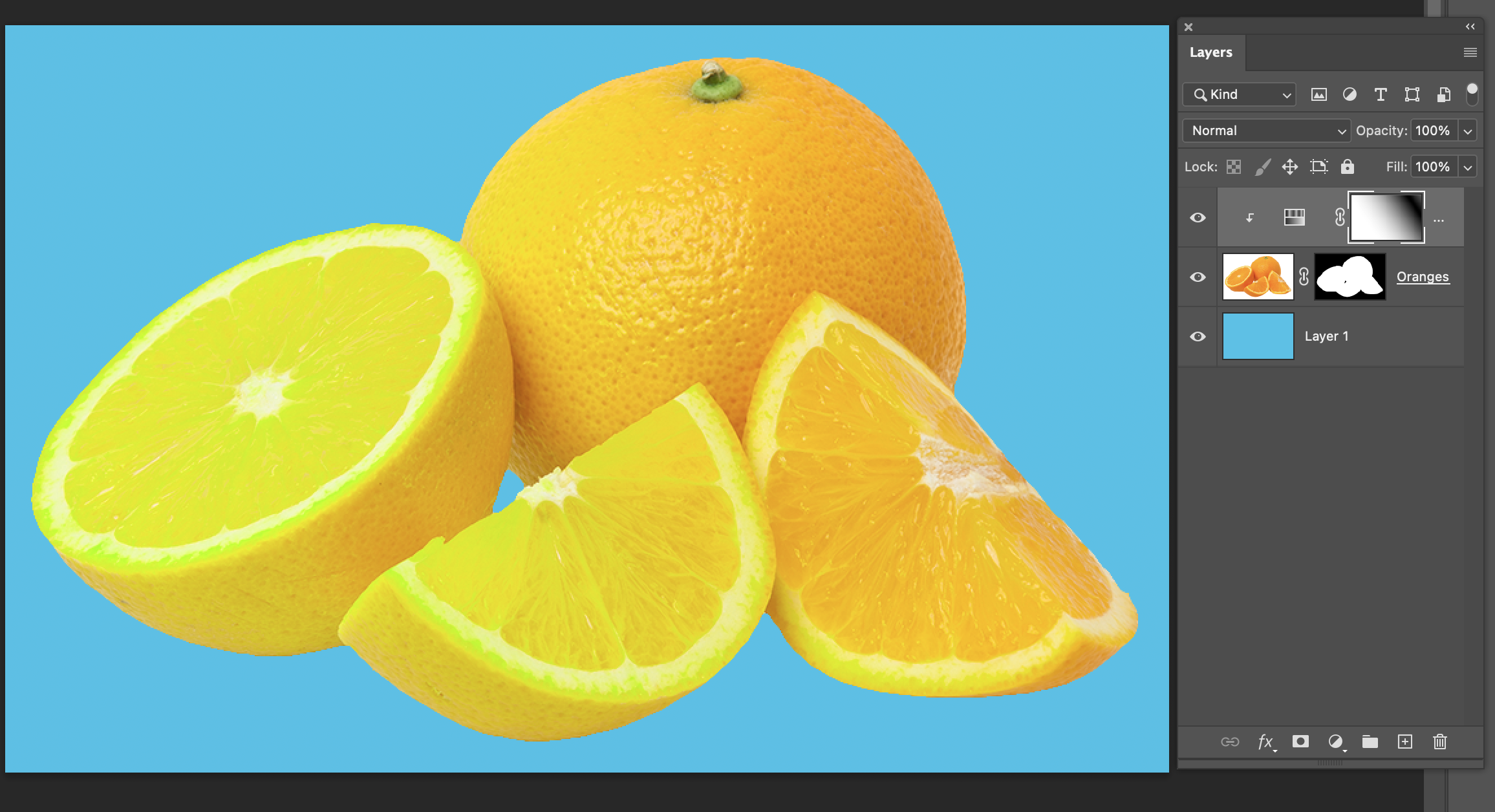
We can also edit non-destructively for colour adjustments. Click on the icon that looks like a half circle at the bottom of Layers, and choose “Hue/Saturation“. Now, in the Properties panel, move the top slider for Hue to change the colour:
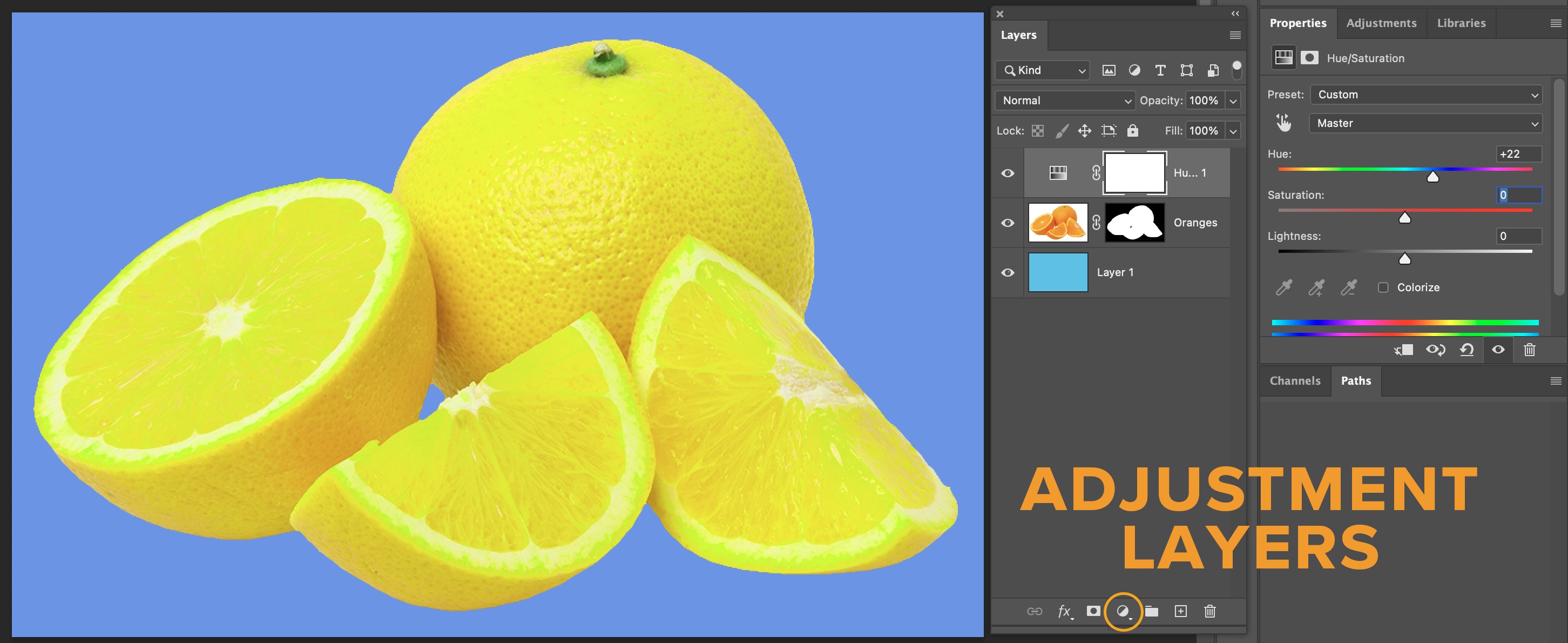
We’ve now got a colour adjustment that lives on its own layer. That means we’re not stuck with it as a permanent choice: we can turn it on and off, adjust its settings, and keep coming back to it as much as we want. You can also get the same adjustments from Image > Adjustments in the menu, but if you do it that way, they’re not a separate layer.
Right now, that Hue/Saturation is affecting everything underneath, and it’s also changing the colour of the background. What if we don’t want that, and only want the colour change on the oranges?
If we option-click or alt-click on the horizontal line in between the layers, we can clip them together, so that adjustment only affects the oranges and not the blue background:
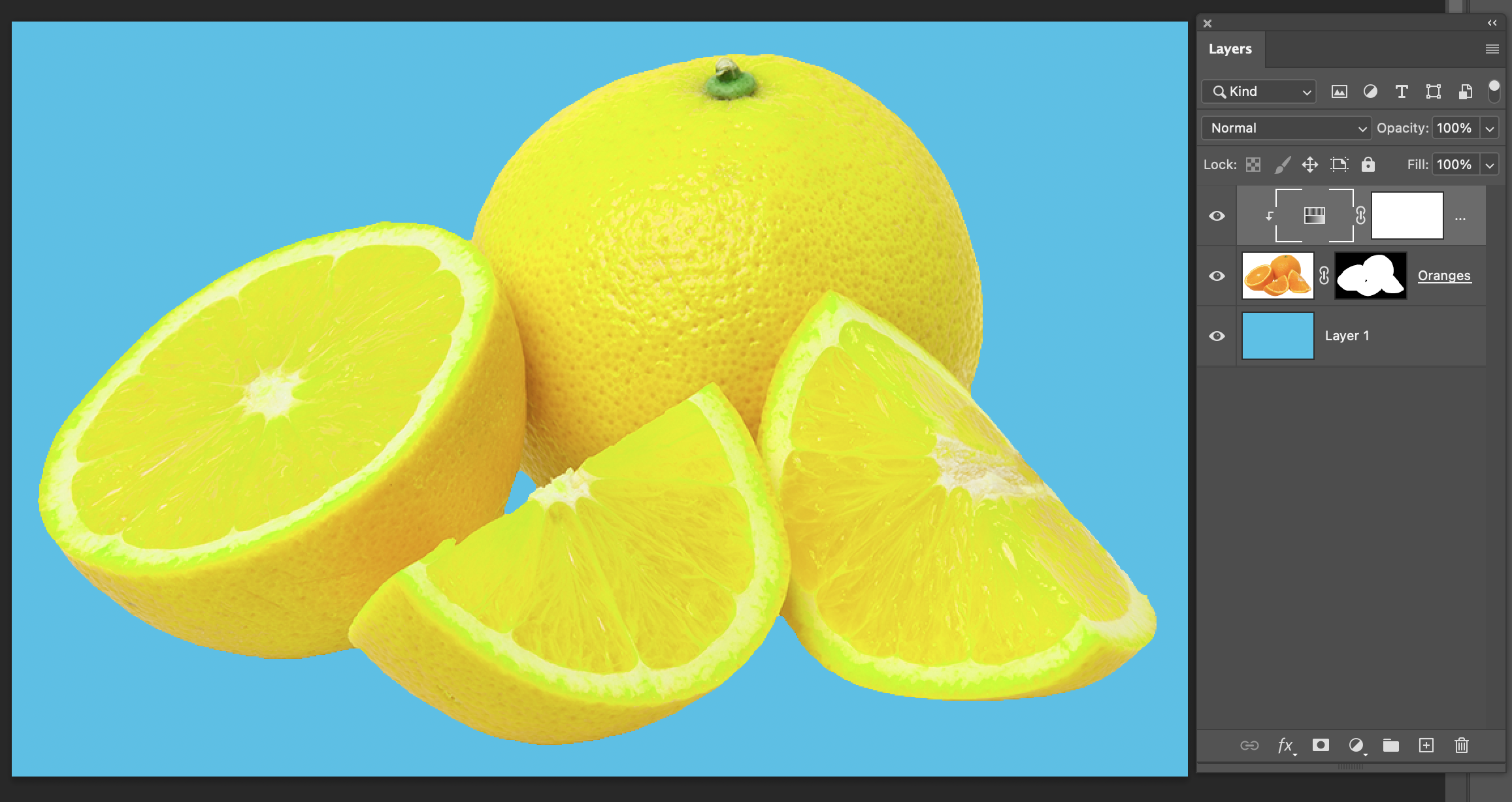
Another way to control this is to put layers together in a folder, with either the folder icon at the bottom of Layers, or Layer > Group Layers in the menu, and change the blending mode for the folder between “Normal” or “Pass Through”.
Also notice: our new adjustment layer came with a mask! It’s all white, which means 100% of the area is showing. But if we add any black or gray to that mask, the colour change will be partly hidden. Here, I drew a black and white gradient on the mask so that the colour fades from the original orange to the adjusted yellow.
Easy Selections, Tough Selections
The image with the oranges is one of the simplest possible starting points for selections and masks: it’s a distinct shape with hard edges on a solid background. The hardest selections and masks to work with are images that have complex, textured, or soft edges (hair, fur, and grass are famously the most difficult to work with), and images where the subject’s colour, texture, or edge is similar to the background.
This dog photo is an example of something that would be a bigger challenge for a selection and cutout.
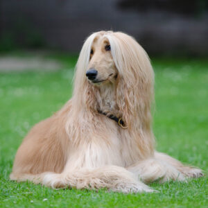
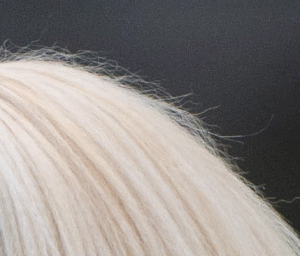
The hair texture is wispy and complex at the edges, and the background is intentionally soft and blurred. If we needed to do something like place this dog model on a different background for a magazine cover, we’d need to either be okay with a less natural-looking smooth edge, or put more effort into refining a mask. This is such a common problem to solve that Photoshop’s “Select and Mask” window includes tools for it like “Refine Edge Brush” and “Refine Hair”. They’re useful, but it still takes some skill and strategy to get a really nice result.
If you’re working on a project where you get to take or choose your own images, keep in mind that you can save yourself a lot of work with your image choices! If you know you’ll be doing a collage-style layout with lots of cutouts, you could avoid images that you know will be unnecessarily hard to cut out.
(And if you’re really interested in mastering hair selections… that’s a topic where a lot of people have made and shared tutorial videos with Photoshop tips and tricks, especially for fashion images. It should be easy to find if you search on your favorite video platform.)
Image Credits
These images all came from Wikimedia Commons, which has a large collection of creative commons, public domain, and free-to-use media. The versions included in the demo files have been resized and renamed.
You can download full-resolution original versions from these links:
Bird photo:
https://commons.wikimedia.org/wiki/File:Ara_macao_qtl1.jpg

© Quartl / Wikimedia Commons
This file is licensed under the Creative Commons Attribution-Share Alike 3.0 Unported license.
Orange photo:
https://commons.wikimedia.org/wiki/File:Orange-Fruit-Pieces.jpg

© Evan-Amos / Wikimedia Commons
This file is licensed under the Creative Commons Attribution-Share Alike 3.0 Unported license.
Dog Photo:
https://commons.wikimedia.org/wiki/File:Afghan_dog.jpg

Author not named.
This file is made available under the Creative Commons CC0 1.0 Universal Public Domain Dedication.