
Raster image files are made up of a grid of tiny squares called pixels. Higher resolution means the image contains denser pixel information, and can display or print at larger sizes without losing quality.
ppi and dpi
ppi: pixels per inch (screen)
dpi: dots per inch (print)
It’s technically correct to use ppi if you’re talking about a file or an image onscreen, and dpi if you’re talking about printers and printed artwork…but you’ll often hear people use them interchangeably.
How much resolution do you need?
|
★72 |
Legacy standard for screen and web |
|
100 |
|
|
150 |
The in-between zone |
|
200 |
|
|
★300 |
MINIMUM for most printing |
|
400 |
|
|
600, 1200+ |
Printing black & white or grayscale images at 600+ looks nicer and more crisp in print than 300. Scanning or working at a higher resolution, and then reducing the file for your final print or screen images, is a good idea. It’s always safe to start out with more pixels to work with than you need – the downside is just that the file sizes are bigger, and it may not be efficient for slower computers. A common practice in some types of illustration is to work bigger and then reduce the art for print (for example: work at 600 and print at 300, or work at a file size with double the width/height of your final print), which makes everything look smoother and compensates for rough or wobbly lines. |
Resolution Basics in Photoshop
Open an image in Photoshop, and go to Image > Image Size…
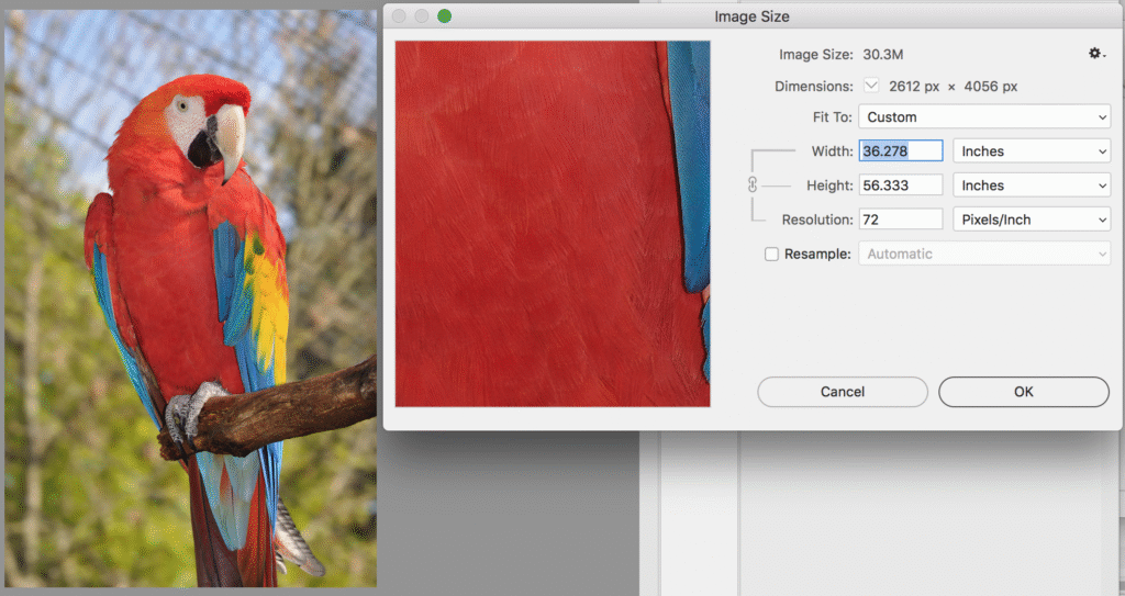
Here we see pixel dimensions, width, height, and resolution at 72ppi. We know that 72 is a relevant number for screens, so these numbers aren’t very useful yet if we want to prepare this image for print! Let’s change what’s shown here.
It’s very important to pay attention to the Resample checkbox:
Resample OFF:
Width, height, and resolution are all linked. Making the size bigger automatically makes the resolution lower, and making the size smaller makes the resolution higher. The pixel dimensions are not affected – this really just changes which way you’re looking at the same math:
 The same image that is 36.278 inches wide at 72ppi is only 8.707 inches wide at 300ppi. That means it couldn’t print bigger than that size without losing quality. The inch size would be even smaller at 600ppi.
Resample ON:
Only width and height are linked, and resolution is separate. Here, you can change resolution while keeping width/height the same, or change width/height while keeping resolution the same. Notice that the other value that’s actually changing if you do this is the pixels. That’s what “resampling” means: allowing Photoshop to actually add or eliminate pixels from the image. Be careful, because it’s very easy here to enlarge an image beyond its original resolution, adding extra pixels, and end up with a low-quality result.

If you’re reducing the size of an image, it’s usually a good idea to keep a copy of the original full size version saved too, just in case.
Resolution and Size for Web and Screen Images
In Photoshop or Illustrator, you can use File > Export for Screens (Illustrator )/ Export As (Photoshop) or Save For Web (both) to quickly save files appropriate for screens at specific pixel sizes, without having to change the size of your original working file. It can also be useful to use a new document preset or workspace settings optimized for web/screen/mobile, with the default units set to pixels and the colour mode set to RGB.
The most important size information for images meant for screen use and not printing is usually width and height in pixels (px), and looking at the size in inches or mm can be distracting, and not very relevant. Why? Because how physically big an image appears on a screen depends on the screen! Think about how many different types of screens are in the world (laptops, desktop monitors, TVs, projectors, phones, tablets, old screens, new screens.) All of them have their own specifications for how physically big the screen area is, the maximum number pixels per inch it’s capable of, and whether the user can change the display resolution. So, what can you do?
- Consider aspect ratio (width:height proportions), and whether you’re designing for any standards like 16:9 widescreen.
- When designing for a platform that specifies pixel dimensions (for example, websites or social media), pay close attention to those numbers.
- If you know you’re designing for a particular device (for example, knowing a project will be shown full-screen on a specific model of iPad in the grad show), look up that exact device screen’s display resolution, or see if your software has a preset for it. You should be able to find the numbers in the product information on the company’s website – you’re looking for a pixel width and height (like “2360 x 1640”.)
- Consider whether a project can or should respond or adapt based on the user’s screen.