
A duotone is a type of image that starts with a grayscale file, and then splits it to print with two inks. This can give the image an interesting sense of depth, and create layered colours that you can’t get with either of the inks by themselves. Let’s take a look at how to set up duotone files for Risograph prints:
Grayscale Mode In Photoshop
Open your original image in Photoshop. We’re going to switch the colour mode to Grayscale, by going to Image > Mode > Grayscale in the menu. After doing this, you should now see the word “Gray” in the tab next to the file name.
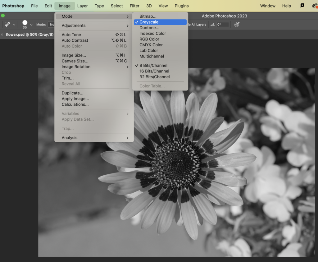
If you’re starting with a colour image: you can also try Image > Adjustments > Black & White first, before Image > Mode > Grayscale, to customize how it’s converting your colours to gray. We want to see a nice light/medium/dark contrast here.
Grayscale to Duotone
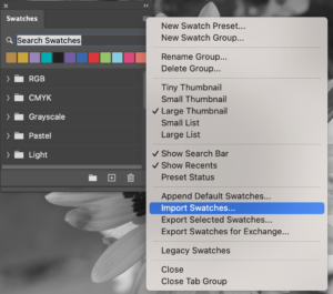
If you’re going to be placing your duotone in an InDesign or Illustrator file that uses our special Riso colour swatches, everything needs to match – so, if you don’t already have them, download our custom set of studio spot colours. Then, open Window > Swatches in Photoshop, choose “Import Swatches” from its side menu, and choose the “COMD_Riso_custom.ase” file from the folder you just downloaded.

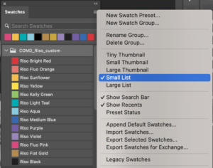
It can be useful to switch the view of your swatches to “List” instead of “Thumbnail”, because we’re going to need to be able to see what their names are. If you’re looking at the thumbnail swatches, you can also see the names by hovering your cursor over them.
Now, let’s turn this gray image into a duotone. Go back to Image > Mode in the menu, and this time choose Duotone.
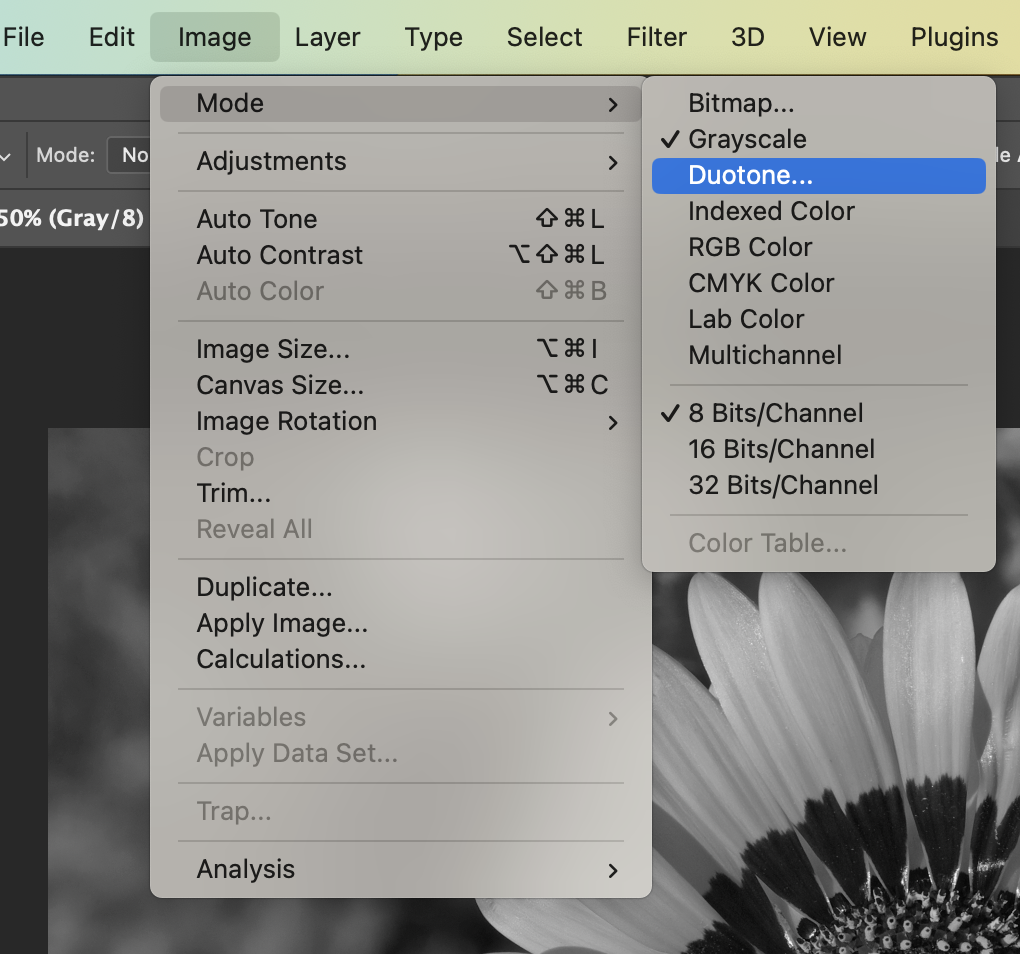
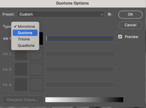
If you see only one colour, and the type is Monotone, open up the dropdown to change it to Duotone. You can also see we’ve got options for 3 and 4 colours versions here, if you want to try that later!
Now, let’s pick our two colours:
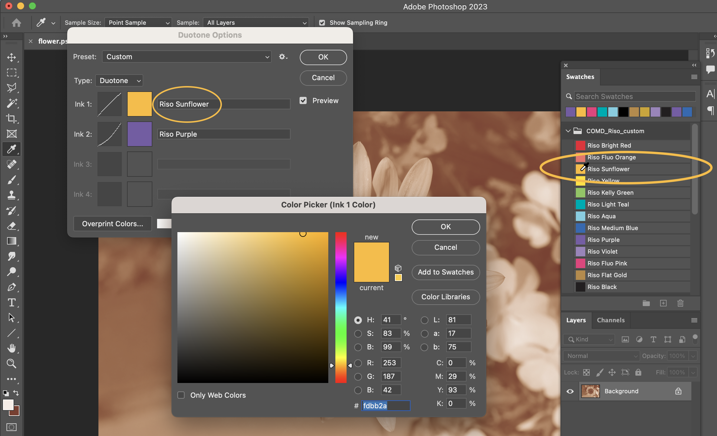
For each colour, click the colour square in the duotone window, and then, when the Colour Picker window is open, click the colour you want over in Swatches. Your cursor should turn into the eyedropper for this. After pressing OK in the Colour Picker window, you need to type exactly the same colour name next to the colour in the Duotone window.
The exact match only matters if you’re going to be placing this image in InDesign or Illustrator, and need to match the same inks. If your only file for Riso printing is going to be this one from Photoshop, it doesn’t matter – you can use any colours, and name them anything.
If you’re using Pantone colours, you can find them by clicking Color Libraries in the Picker window here. It will automatically fill in the names for the duotone colours, but you still need to make sure everything matches between Photoshop/Illustrator/InDesign.
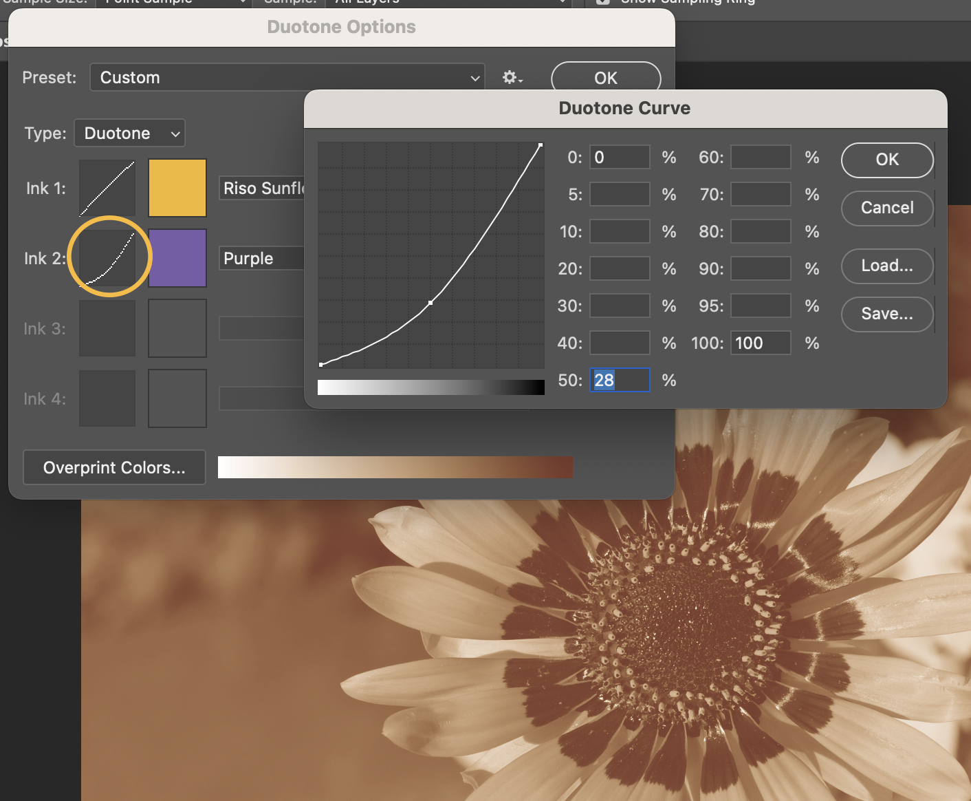
You can customize the balance of highlights, midtones, and shadows for each colour by clicking on the line graph next to the colour square.
Saving
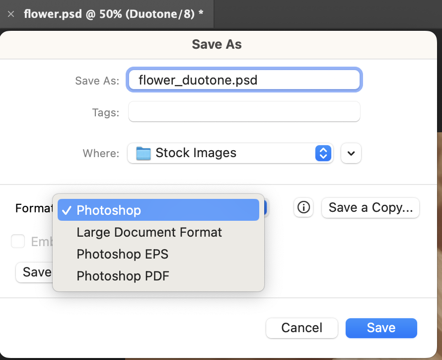
You should now see “Duotone” in the tab next to the file name. Let’s save this with a new name that includes the word duotone, so it’s easy to tell apart from the original. Go to File > Save As, and save it as a .psd file (the format should be “Photoshop”.
Placing in Illustrator or InDesign
A convenient thing about saving this as a duotone file is: we can place it in an Illustrator or InDesign file (File > Place), and it will bring along both colours for this 2-ink setup.
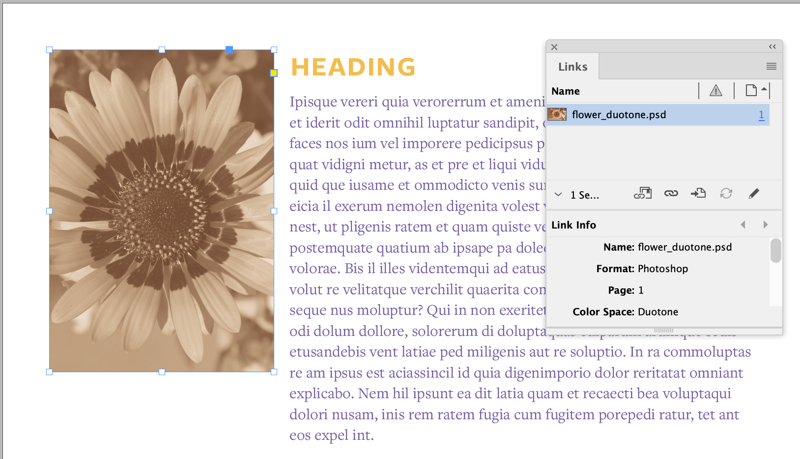
Here it is in InDesign, in a file that is also using the same Sunflower and Purple colours for text. In Window > Links, you can see that says “Color Space: Duotone” for this image. If this isn’t working, and that says Gray, RGB, or CMYK, then the file isn’t saved in duotone mode, and it’s time to go back to Photoshop, check Image > Mode and the duotone settings, and save it again.
To check whether the swatches match: open up Window > Output Separations Preview in InDesign (or Window > Separations in Illustrator), and you’ll see a list of every colour in the file that is a separate ink. Click the eyes to turn OFF every colour you’re not using, and keep only the ones you are.

If you have any almost-duplicate colour names in the list, that’s a sign that something’s wrong and doesn’t match. You only want to see one for each Risograph ink colour.
You can also look at them one by one, and it will show them in grayscale. That’s what your print files will look like for each colour, after generating separations. See how the two versions of the flower photo add up to the duotone image?
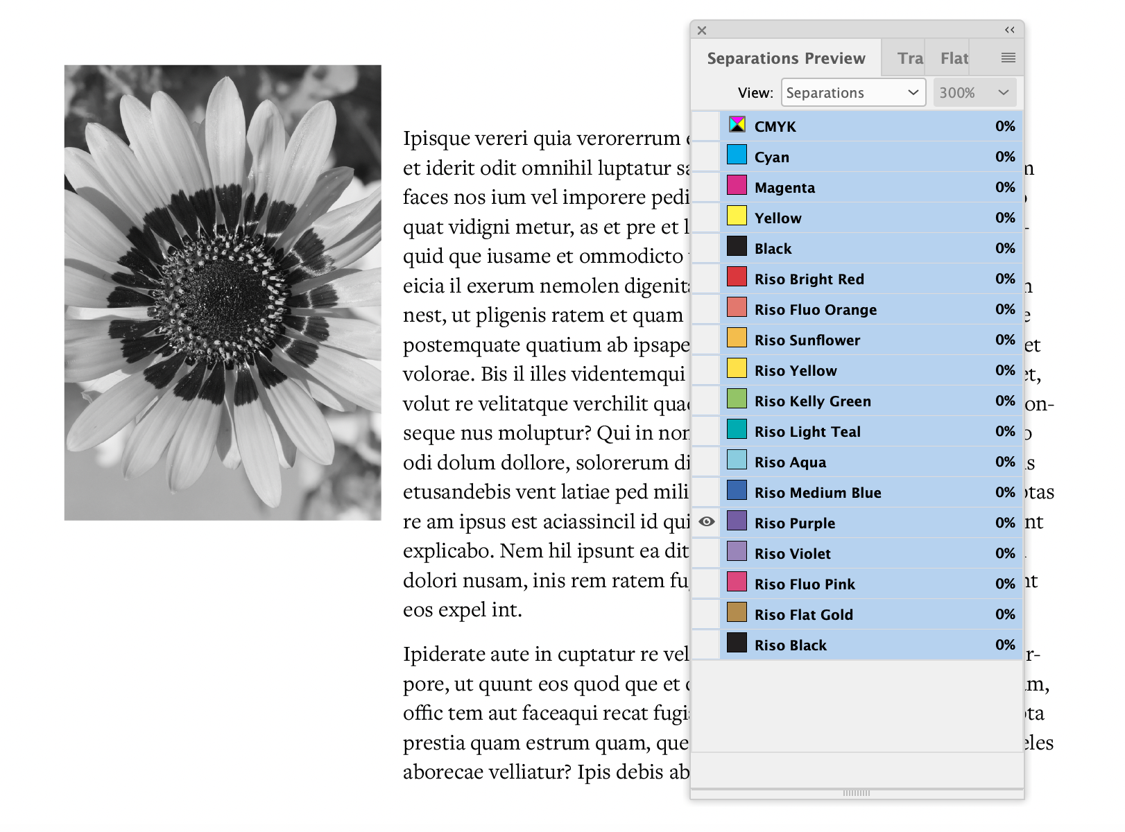
If everything looks good here, that’s it – for printing, you can either bring your working .indd or .ai file with these swatches to a COMD tech appointment, or take a look at how to generate your own separations for printing.
But if you’re interested in more duotone tips and tricks, read on…
Splitting the Duotone
Let’s look at that duotone file in Photoshop again, this time with Window > Channels open. There’s only one channel here, and it’s called “Duotone”.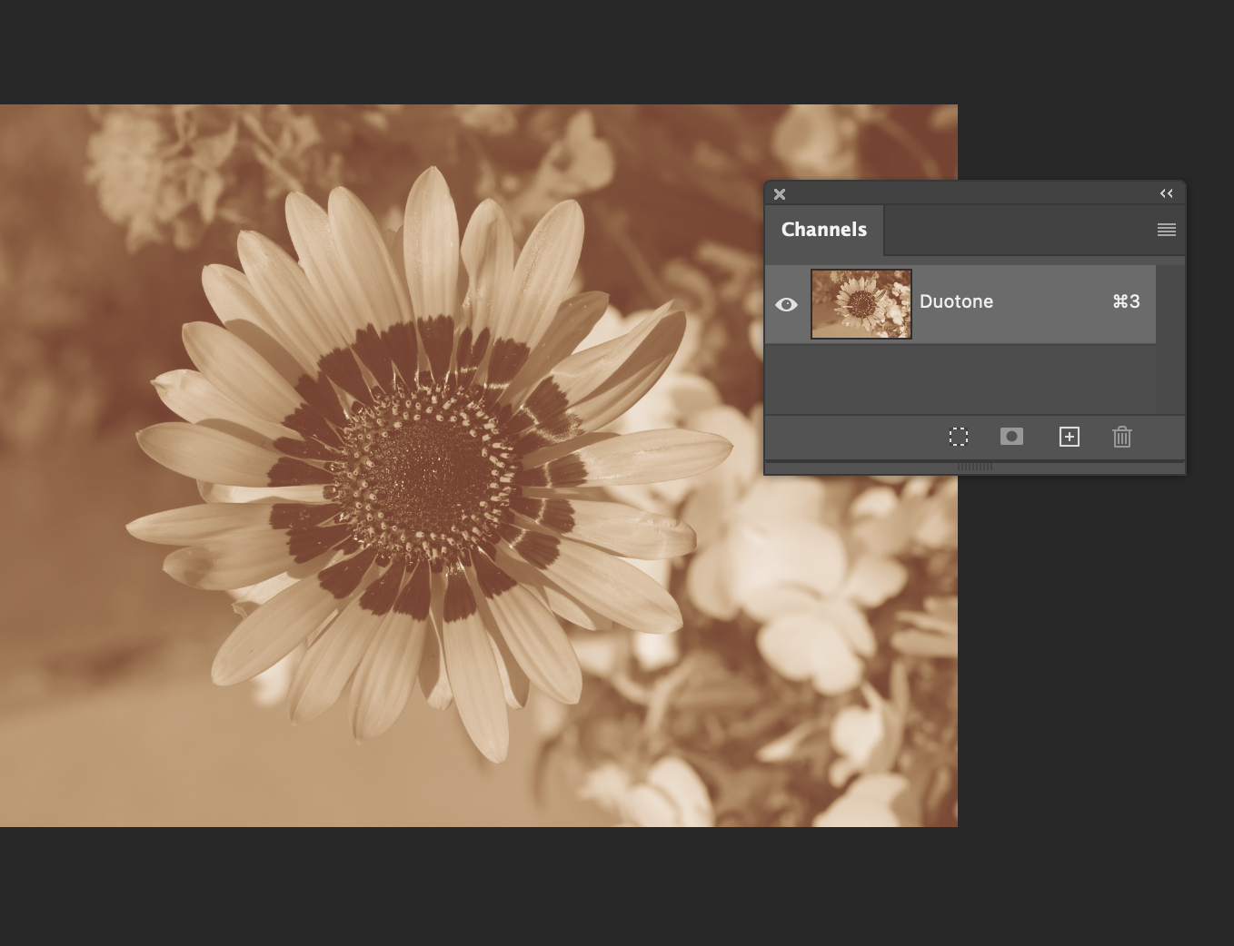 But what if we want to customize this by playing with each colour separately, or get each half as its own file?
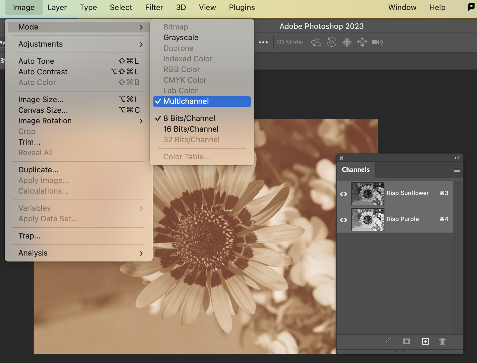
Go to Image > Mode in the menu again, and choose “Multichannel”. Now we have a channel for each colour! You can work on the art in each channel with any Photoshop tools or functions that work in black/white/gray.
For example: I drew a white gradient on the Sunflower channel, so that colour fades out on one side and more purple is showing.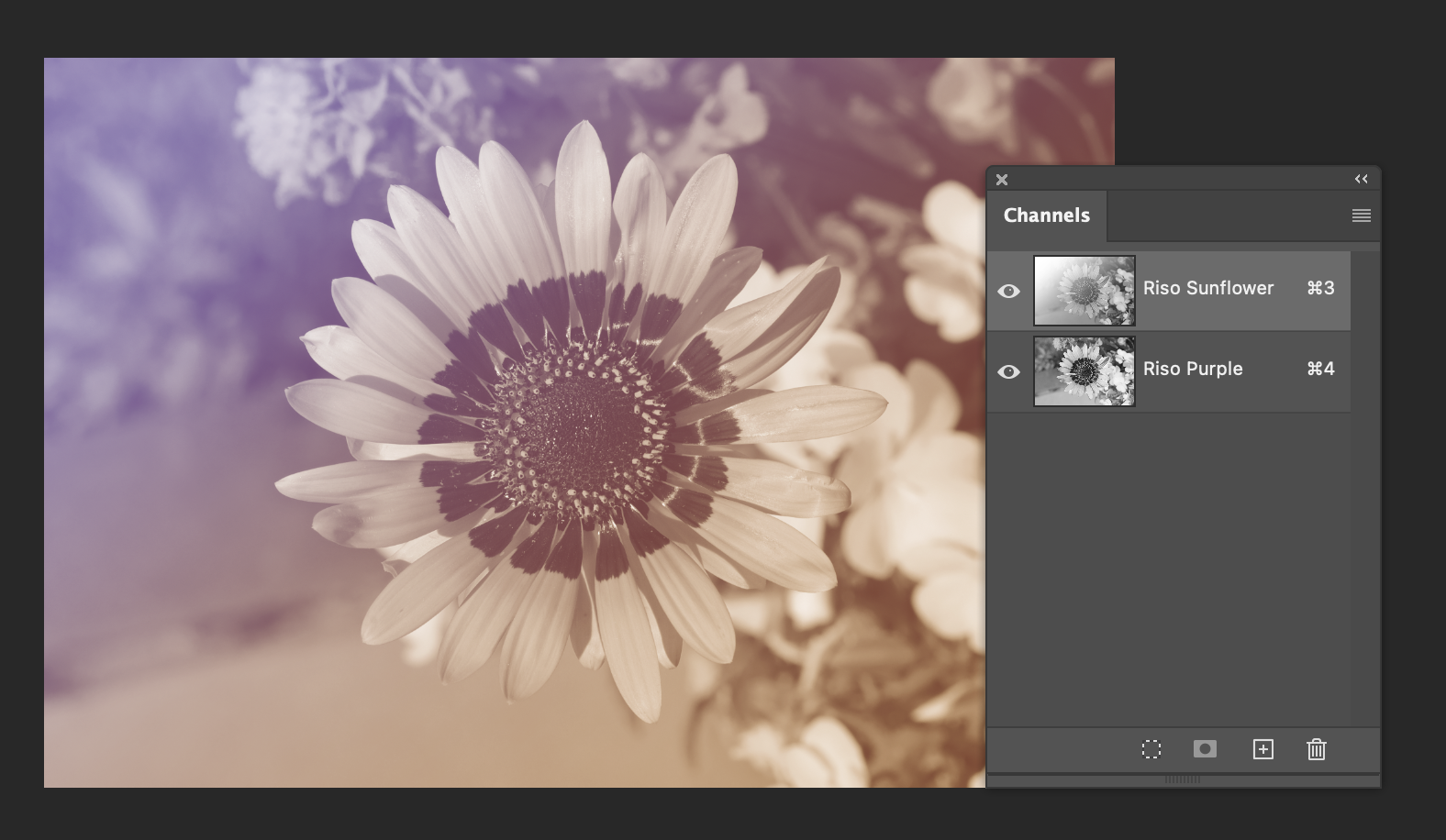 If you want to save one file in Multichannel colour mode and place it in InDesign or Illustrator, it’s more complicated – it has to be saved as “Photoshop DCS 2.0” instead of a regular .psd file.
However: something we can do instead for either Duotone or Multichannel, that actually makes everyhing more flexible to work with, is to break it up and then put the pieces back together in the .indd or .ai file.
Go to the side menu in the Channels window, and choose Split Channels. This will actually close the Multichannel file, so make sure it’s saved if you might need to go back to it!
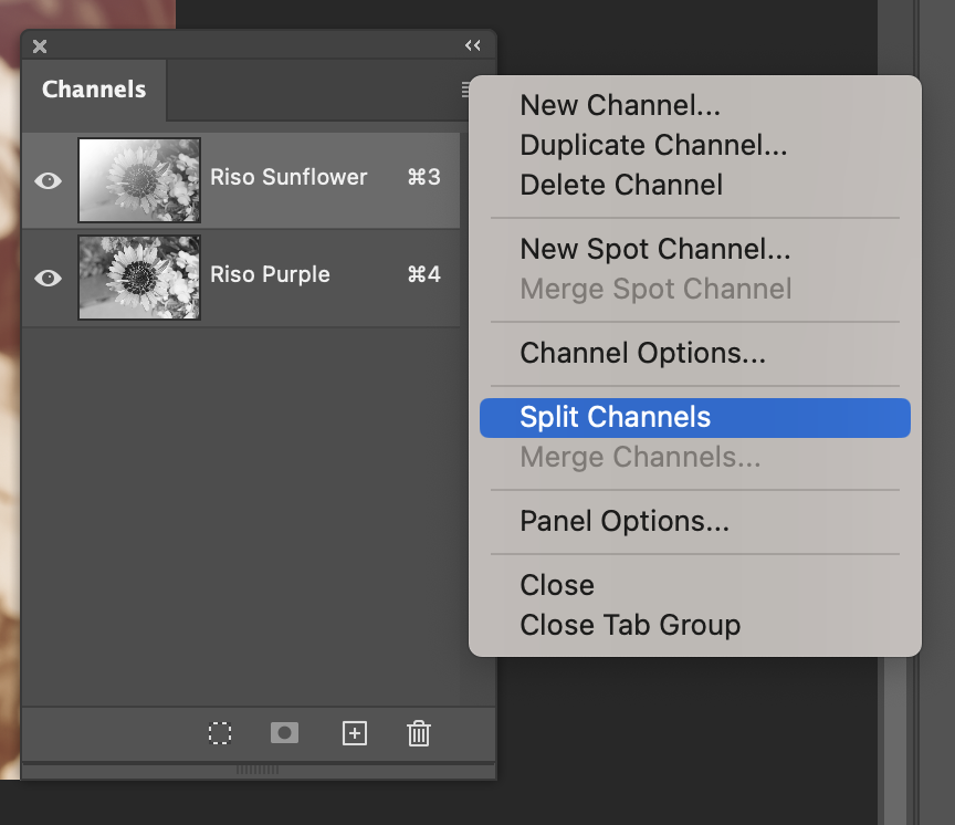
It will open a grayscale file for each colour, and the names will conveniently have the colours in them: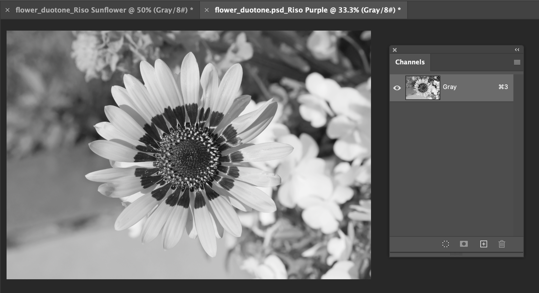
They’re not automatically saved yet, so go to File > Save As for each of them, and make sure they get saved somewhere that’s easy to find, as either .psd or .tif files, with the right colours in each name.
Now, we can place both of these gray files in InDesign or Illustrator…
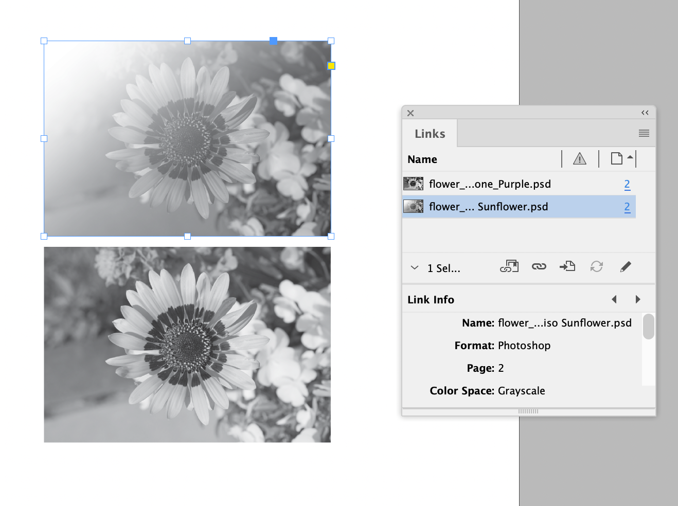
And, selecting the image content and not the frame (one way to do this is to click the image with the white arrow, the “direct selection”), you can apply colour swatches to each!
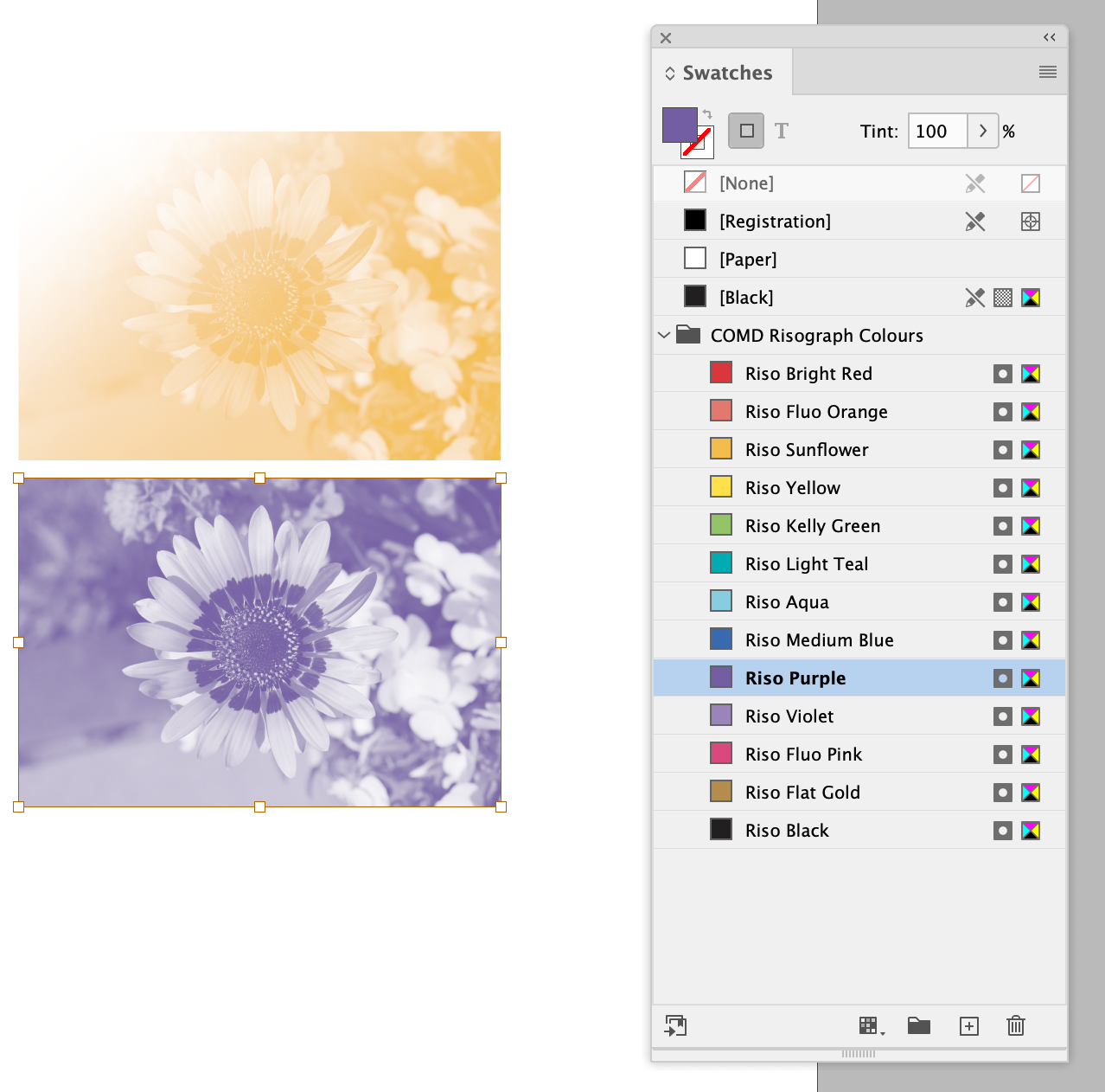
To get them to line up and overprint: with both images selected, set the blending mode to Multiply, and use the Align tools to align them to each other. In InDesign, Multiply is in Window > Effects, and Align is Window > Object and Layout > Align. In Illustrator, it’s Window > Transparency, and Window > Align. 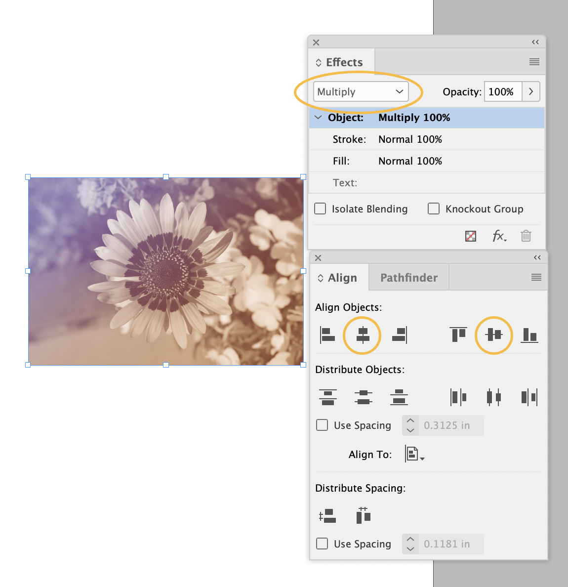
A nice thing about using the gray files like this, instead of the duotone files: you can change your mind about the colour, and apply any swatch to them! If it’s a duotone, you would have to open it in Photoshop again, change the duotone colour, and re-save it.